Saturday, December 27, 2008

The Disneyland Paris that never was - Part two


Here is the awaited part two of this Disneyland Paris that never was article.

Adventureland’s Indiana Jones temple du péril was built in 1994 , shortly after the opening , and , although it’s a very popular ride with perfect theming , the following renderings, as well as the one above, will show you that it could have been even better. This is probably a good example of management’s cut for budget reasons - or may be , a question of construction timing, as ,in 1994 , the park needed to add new attractions urgently.
Anyway, the two first pictures and the one above will show you some never done additional decors, with the train entering a giant asian statue head.


These scenes with a loop around a giant gorilla statue or going through this stone eagle would have been great, too...


And what about this audio-animatronic tiger - coming right out of the “jungle cruise” ? it would have been great! May be they will add it one day, it’s not a so expensive addition...


...As well as those baby tigers audio-animatronics in the queue outside decor.


Close to the Indiana Jones coaster , stands the former “explorer’s club restaurant
( now “colonel Hathi “ ) . In this John Horny rendering , if you look closely, you’ll see Jacques-yves Cousteau and Ernest Hemingway in the front , and in the background, but hard to see, Indiana Jones and Crocodile Dundee, all famous explorers indeed!. Note the parrott over the bar tender, actually there is really audio-animatronic parrots in the restaurant, and there is a good reason for that, as the place is a reminiscence of the old Tiki room restaurant concept , as it was supposed to be in the 50’s , before it was decided that the Tiki room will be a show only. 35 years later the John Hench concept partly live, here, at DLP.


The DLP Pirates of carribean version is known to be a great one , and here is a map of the ride


Let’s have a look at Fantasyland, beginning by the castle. On this concept-art by Frank Armitage , here is the castle how it is right now.


But who knows that the great Herb Ryman had also designed a different and smaller one ( note on the right the presence , here, too, of the main street elevated tramway concept. )


And here is probably the most revolutionary castle concept with this futuristic castle imagined by imagineer Tim Delaney...may be too futuristic for some, but what a great idea.


In Fantasyland, this early rendering of Alice’s curious labyrinth shows a different one than the actual one , and , inside the castle of the king of heart, children coming down with the slide from the tower ( now closed, unfortunately ) would have come out through the mouth of the queen of heart .


Of course, everyone have heard of these two never done attraction concepts - the little mermaid dark ride and the beauty and the beast show - they were even announced during the tv special for the opening of the park! The one that we all miss is the Little mermaid ride ,as guests would have board inside shell designed vehicle , hanging from the top, like in Peter Pan’s ride. Actually, you can find a special feature in the Little mermaid collector’s edition dvd , describing the whole ride concept for those of you who want to know more about it. The attraction was supposed to be built in front of the pizzeria della notte , near it’s a small world.
But may be all is not lost, as it seems that there is some talks to build a Little mermaid attraction at Disneyland, Anaheim...let just hope they will choose this wonderful concept...


The Beauty and the beast musical would have been built behind Cinderella restaurant , and would have involved Audio animatronics and special effects, but i’m afraid that we will never see this one . That’s the sad theme park reality: some concept will come to life, other will stay forever in our dreams. Well, it looks like real life, doesn’t it?


Don’t miss the part three where i will take you to the Discoveryland that never was, as well as stunning concept for the hotels of the park, and you wil not believe your eyes.
Most of the renderings that you saw here are coming from my book “Disneyland Paris, from sketch to reality” who tell you all about the creation of the park, thanks to 750 pictures of the park including 250 renderings, and a great text by Didier Ghez.
You can order easily the book to me or through Amazon, see on the right column how to do it.

All artwork and photos: copyright Disney

Friday, December 26, 2008

The Disneyland Paris that never was - Part one


Hello all. Here is the first part of a four part articles about the "Disneyland Paris that never was".
As you know, when WDI imagineers begin to think about a new park or attraction, the phase one is call “blue sky” , everything in this phase one can be imagined, as there is still no limit that the future budget will put inevitably. Then , from the blue sky , comes the comeback to earth , and choices must be done . Mind you, it’s not that the imagineers love to do some “cut” in their wonderful concepts, as they are always pleased to enhance any project, or put more theming details when it’s possible . The best example is tokyo disney sea, although, even in this one some choices had to be done , i.e wth the “Voyages of Sindbad attraction as the first concept looked more like pirates of caribbean with man-size real audio-animatronic than the actual one with its oriental “small world puppet” theming.
To come back to DLP, and although the budget for the park, back in 1990 , was high, the imagineers had to make choices. Most of the time, they’ve kept the best. Sometime, as we will see, the project they had in mind was really too expensive...others were not really that expensive, but the park’s management obviously decided to do some “cut”.
It’s always the same thing when we look at renderings of “never done “ projects: we want this one to be built immediately! .........and we forget that what we already have is great! So, most of these coming projects will never exist, although, as they say at WDI “a good idea never die”. Let’s just dream about them, leave your mind enter the art-work and imagine that it’s real.

To begin by the beginning, the first picture show you a model of the park, and, that’s how it looks before the imagineers decided to add Autopia, with the disneyland paris hotel at the entrance.


Now, this first rendering show you a pretty different entrance, with two small lake where the fantasia gardens are now, and a big one at the bottom with a wharf and a boat where now stands a big boulevard.


the next one is a “winter” version of the previous one, where imagineers have imagined the small lake frozen , and where people can do ice-skating on them ( Actually, this is possible in front of the New York hotel , so all is not lost )


This town square rendering shows main street entrance with coconut trees....probably somebody forgot to tell the artist that paris weather was not exactly the same than the one in florida...!


Here we come to the really interesting one. It’s not very known, but we were at two fingers to get a really different main street than the actually, regular one. Instead to have a “turn of the century” theming, imagineers had designed a main street set up at the 20’s-30’s , ruled by gangsters, jazz, cinema, with a totally different design.


The imaginers envisioned an elevated tramway going all along main street and inside the arcades. This would have been great, and it’s the kind of idea that we would love to see it real.


However, it’s also the perfect example that “good ideas never die” as this elevated tramway was finally created.....at the other side of the world, in the new york area of tokyo disney sea !


Always in that 30’s theming , a luxurious and art-deco restaurant , a kind of private“club 33” located behind the Main Street Transportation Co. building, would have give you the feeling you’re dining on a train.


And a tribute to cinema would have been done with a circle-vision theater inside a classic 1920’s cinema located on main street.


Inside discovery arcade, here is an early walk-through concept that would have been dedicated to automats - early mechanical figures, full of real antiques. This one could still be done one day with the will of the park’s management, as it should not cost millions of dollars - although antiques are not that cheap...


Some time, it’s a shop concept that disappeared, like this early concept rendering for a Main Street confectionery


In frontierland, most of the original concepts were realized, but sometime , small changes makes big difference. Take this early model of Phantom manor, for instance. Next to the manor you can see a barn where now instead stands a totally different queue building.


But what i miss the most is the great voice of Vincent Price who was recorded - as Phantom Manor ghost host. For a little while , at the opening of the park , visitors were welcomed by Price’s voice, until it was realised that this only english version was not understand by the french audience.....But the ghost laughs that you can hear during the ride are still Vincent Price laughs! A little story about the recording session: when it was recorded , Vincent Price was already at the end of his life , and really tired, physically speaking. So, the agreement was that Price could come for the recording , but just for one hour. Everything was ready, and Price arrived at the recording studio. He look really tired and everybody hoped that he could do it right....then he begin to read the text, and , all of a sudden , it was magical. A few takes were done, and that was it! Probably one of the last thing that Vincent Price did with all his genius. However, all is not lost , as this recording was released on the Haunted mansion anniversary cd , that you can still find easily.


In the next article, we will talk about the Adventureland and Fantasyland that never was, so stay tuned on Disney and more!

Most of the renderings that you saw here are coming from my book “Disneyland Paris, from sketch to reality” who tell you all about the creation of the park, thanks to 750 pictures of the park including 250 renderings, and a great text by Didier Ghez.
You can order easily the book to me or through Amazon, see on the right column how to do it.

All artwork and photos: copyright Disney

Wednesday, December 24, 2008

Merry Christmas to all Disney and more readers !


Today is December 24th, and i wish to all of you a Merry Christmas and a magical Christmas evening. For this 2008 Christmas evening, as it is the tradition, i have a little gift for you, a rare and beautiful Jungle Cruise Artwork by Disney artist Charles Boyer.

It's a great painting, as all the different scenes of the Jungle Cruise attraction are on this artwork.

Enjoy it, and once again, have a magical evening!


Artwork: copyright Disney

Sunday, December 21, 2008

Lost Horizons...


Lost Horizons was the title of Frank Capra's famous movie - you know, that movie where adventurers find Himalaya's legendary lost city of Shangri-La... But for us, Disney theme parks fans, our Lost Horizons is Epcot beloved and now unfortunately extinct attraction. So today, here is a grand tribute to the Horizons attraction who was one of my favorite. Lot of pictures, for the first time in big size, plenty of artwork, and great video of the whole ride at the end of the article, with the links to the previous Epcot original attractions artwork articles.


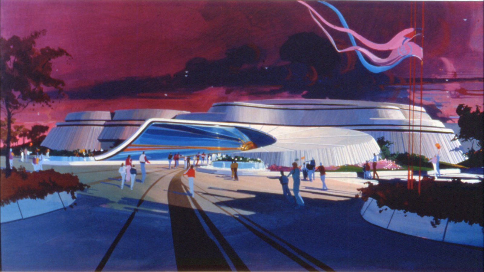
Horizons, designed by imagineer George Mc Ginnis and Collin Campbell opened on October 1, 1983 and was about the future!...and more specifically, Horizons was dedicated to "humanity's future" with this principle "If we can dream it, we can do it!".
Not only the building was huge, but the 14.45 minutes ride was one of the longest one ever created by Walt Disney Imagineering. Lot of audio-animatronics - 54, exactly , and 770 props all along the ride, not to mention the 12 film projectors, the two Omnisphere screenshow, and a huge capacity of 2784 guests per hour.Everything was great: the story line, the theming, the music, everything!


During 10 years - from 1983 to 1993 - the attraction sponsor was General Electric, as we can see on this picture of the entrance.


Right after the entrance, the Futureport announced the "destinations"


It's time to board in one of the Horizons vehicles


First, we had a look back to some of the great visionaries like Jules Verne, then to how the future was dreamed in the 30's.
Here is a picture of the model of that scene.


And here are pictures of the real thing.


The next scene was a vision of the future from the 50's.


After these opening scenes the Horizons vehicle moved to the Omnimax film sequence with images of the DNA chain, or the space shuttle lift off. The next scene was the 21st century Habitat sequence , also called the Nova City living room.


A huge backdrop painting was done for that scene, here is three close shots of this artwork.


The next scene brings the guests at Mesa Verde, a desert farm of the future...


And then to a submarine habitat...


But also inside a space colony and the "crystal lab"...


The Holographic "happy bithday" party line was the next scene, and the special effects were at that time really impressive.


The guests had then the possibility to "choose their tomorrow" with a choice of three destinations: Space , Desert, and Undersea. A screen came in front of the vehicle and a short movie was played. A good idea, but the image definition was not as good as it would be today.

Before we arrive to the videos below, i have more rare pictures for you. First, a model of the building.


Then some artwork for the "Main Shuttle port"


Here is a fantastic painting showing a city of the future.


But one of the biggest backdrop painting was the "Looking back at tomorrow". Here are some very rare photos showing the painter at work - Robert McCall, a famous artist who worked mostly for NASA - and details of the painting.


And now it's time for you to board inside a Horizon vehicle and enjoy this fantastic ride, thanks to this 3-part youtube videos from Century3Horizons, that i thank a lot, and congratulate for the high quality of the filming.

Just like everybody who did the ride at Epcot, you will love Horizons instantly, it was Imagineering at its best! And don't forget: If we can dream it, we can do it!


You can know more about Horizons, read the original script and listen the great music theme on the excellent Horizons web site HERE

I remember you that you can find the previous articles about Epcot's original attractions artwork: for Spaceship Earth HERE, for The Living Seas HERE, for Communicore HERE
, for The Land HERE, and for Journey into Imagination HERE. More coming next week about Universe of Energy!

Photos and artwork: copyright Disney Enterprises Inc

Youtube videos thanks to Century3Horizons