
Today, here is the third part of my tribute to Tim Delaney. In this exclusive interview Tim talks about the design of Hong Kong Disneyland's Tomorrowland as Tim was the show producer of this land. As we know, Tim Delaney was previously the show producer of Discoveryland at Disneyland Paris and for Paradise Pier at California Adventure. Please note that this interview was done for the opening of HKDL, before the opening of Autopia and Stitch encounter.
Alain Littaye: Tim, as we know, you were the show producer of Discoveryland at Disneyland Paris. At DLP the theme of Discoveryland was supposed to be the land of visionaries, and here in Hong Kong the theme is probably different. So, what is the story line of Hong Kong Disneyland’s Tomorrowland ?
Tim Delaney: Well, we wanted to create here something totally different, our biggest challenge was how to create something that is not only tomorrow, but also something that is timeless. So, we took the theme in this particular case of a “spaceport”. All of our attractions relate to space travels: we have Space Mountain, Buzz Lightyear, the Orbitron - this last one with a totally different style than the one at DLP.


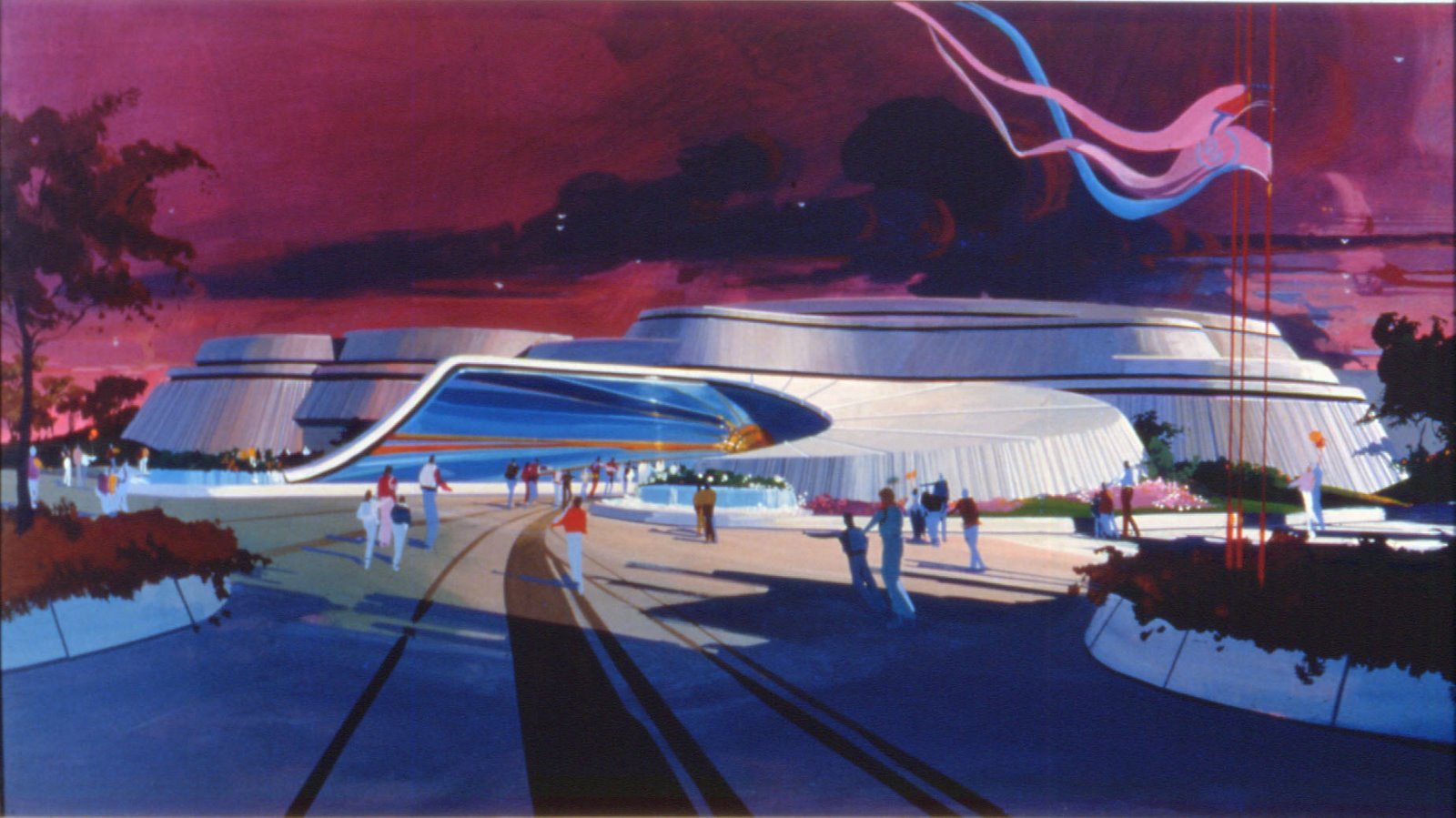
The picture below showsa previous sketch for a Tomorrowland concept finally not chosen.

T.D : So we took the idea of a space port ,we have different style of architecture...it’s a kind of space encampment, a space port where you go when you journey to other planets. We have two very large restaurants, the big restaurant called “starliner diner” have a rocket ship in the front and it’s a place where you go before you go in outer space: there is big posters of space travel inside, we have rockets, etc...this is a place where you go to have lunch and food before you go up to your journey into space mountain and buzz light year...It’s also one of the largest restaurant we ever built in a Tomorrowland with an incredible design


T.D: Throughout the land we’re using these motifs of these planets and an alien landscape to make you feel that you are in another world...You have to see the style of the buildings to see how it looks like. It’s not mean to look like in the fifties, like disneyland was in 1955, it has much more of an organic field to it. We are also using a lot of colours in the land, and the reason for that is that most of the time Hong Kong have grey skies and humid, so we wanted these colours to bring a kind of more of a familiar quality to our Tomorrowland. Secondly, about landscaping, we have a lot of landscaping in covered areas, so we create a sense of the future and tomorrow with more human kind of space.
A.L: I’m pretty sure the design with all these planets is probably beautiful at night...
T.D: It is magnificent, spectacular at night !


A.L: The Orbitron have a totally different look than the one built in Paris or Anaheim , and you have flying saucers instead of rocket jets ...
T.D: That’s right, we wanted to create an Orbitron in the center of the land that has more a kind of space-beacon look to it ...there is a very large eight meter diameter globe at the bottom, it has a starfield with fiber optics in it and the flying saucers fly around, and we still have a kind of planet kynetics, which are flying up above, and these flying saucers flying among all about. It is a very visual thing, a very powerful looking thing, and the colours are all different here. We took a whole different colour scheme because we wanted to make the colours much brighter, much "cooler" colours because it is so warming here most of the time.


T.D:...By the way , the 8 meter diameter globe also rotate and due to the painting technique, the whole land reflects in it and, with the fiber optics, it’s a map of the universe! That’s what it is, in fact. The kind of painting used for the globe is call Chromaship, it’s a special painting and what happens is that when the globe rotate the colour goes from a warm blue to a purple blue...


A.L: Talking about flying saucers, it reminds me the Eddie Sotto project for Tokyo Disneyland’s Tomorrowland. It was supposed to be called ”Sci-fi City” , and one of the attraction was supposed to be small flying saucers flying around a huge flying saucer.
So, are the flying saucers in your Orbitron a reminiscence of this previous project?
T.D: No, not really...i just start it all over again from scratch.


A.L: Anyway, it is a good idea to have change the usual rockets for these new flying saucers. About Space Mountain, does this new version have a particular storyline?
T.D: Our Space Mountain continue the overall theme that is your amazing adventure in outer space. We have new effects, new images, the ride system is smooth and fast, and, as you know they’ve re-done space mountain in paris and the one at disneyland, too. And every time we do this we have new effects, new projectors, new imaging devices,etc... And, here in hong kong, we have the latest one, and they’re brilliant. We don’t really have an overall strong story, but we do have a very strong theme and it’s a really great effects show. And the reaction of the guests here is fantastic.
In fact, talking about effects, there is one effect that you have in paris, and that we have, here: it’s the explosion of a super-nova. But in a completely different format.


A.L: What about Buzz Lightyear? I supposed it’s the same ride that we can find in Anaheim or WDW?
T.D: It’s very similar to the one in Disneyland. But we have a totally different entrance for the attraction: we have a 12 foot monumental, kind of “heroic” Buzz Lightyear standing up in the front, and it’s a great photo location... and the ride is as great as in the U.S, of course. It’s amazing how people love this ride, really. And i've heard they’re going to add some internet competition, so people on internet can compete with people on the ride.


A.L: Do you have a kind of big theater like we have in Paris with “Videopolis”?
T.D: We have two large theater in the park, one in Adventureland, and one in Fantasyland, but not in tomorrowland this time!
A.L: Are you going to add more attractions in the “phase two” of the park?
T.D: We are currently designing and actually we are under construction for one more major attraction and two more minor attractions that will open in july of next year. We’ll have a totally unique and different Autopia than the one you have in Paris. We’ll have electric cars, with lighting effects on the cars, a different kind of unique on-board audio-system, and the landscape that you will go through is much more like an alien landscape, another planet kind of landscape... It will really be a fun drive, and actually we’ll also have one of the roadways who comes into the land , because most of the Autopia will be beyond the railroad, so part of the road will come into the land on an elevated highway and returns back down to the location of the attraction, so it really showcases the ride to the people in the land. And people will be able to walk underneath this elevated roadway that you see the cars are going by.


A.L: Do you think you will have later an attraction themed on the pixar movie “the incredibles”?
T.D: No, right now we’re not doing anything on the “Incredibles” theme for Hong Kong.
Before we leave, i’d like to tell you that the whole resort here is impressive, the location is great, the hotels are beautiful, the “Disney promenade” from the hotels to the park is charming, and these hills in the background behind the castle...i really think it really is the best location we ever had for a Magic Kingdom!

I have added below two youtube videos, one of Tomorrowland at night, and one of the Autopia ride!
Thanks to leave a comment or discuss this article on D&M english forum on Mice Chat
Photos: copyright Disney and, for some of Autopia, Alain Littaye













1 comment:
HKDL was a very troubled park from the start. But on my 2 visits there, i just positively *hate* their tomorowland. It's vague and without focus, artistic direction is ugly. Actually the theme of "spaceport" succeed only by making you experience the soul-less feeling from airports. Looks at best as a cheap imitation/fake from the others. Not to mention that Space Mtn is so lame, you want to sleep thru it and it make IASW exciting & thrilling by compareason. The only thing to salvage is the topiary & landscape from Autopia.
Post a Comment