Saturday, April 10, 2010
Important Note to all Disney and more readers: As i've announced last monday i will stop Disney and more at the end of this month - if you haven't read my message yet please read it HERE. So, if you don't own a copy of the Disneyland Paris book and wish to order one it's now or never! If you like Disney and more, you will LOVE the book full of high-res pictures and LOT of WDI artwork! Please read the article below to know how to order the book.
Looking for a great Disney book ? Then, the Disneyland Paris book is the perfect gift for any Disney fan !
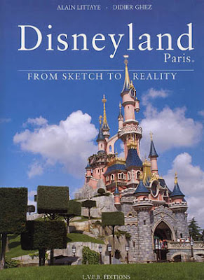
If you're looking for a great gift to offer to anyone you love - including you! - my "Disneyland Paris, From Sketch to Reality" book with its 320 pages and 750 pictures - including 250 renderings from Walt Disney Imagineering - would be a GREAT gift for any Disney fan!
I still have copies of the book, and, as i am one of the two authors of the book, each copy will be sign specially for you or anyone you wish. Of course, don't forget to tell me the name to whom you wish i dedicate the book.
An important note before i go further: If you're not in a rush to get the book, choose the flat shipping option (also indicated below) which usually takes between 3 to 6 weeks delivery (depending if you're living in Europe or in the U.S) and is also much less expensive.
And now, here is a description of the book and everything you need to know to order one of the last signed copy of this beautiful book. Please note that NO re-printing of the book is scheduled, and these last available copies may be the REAL last one!
IF YOU'RE LOOKING FOR THE ENGLISH EDITION OF THE BOOK WITH THE TEXT IN ENGLISH:
Price for one copy of the english updated edition is 87 Euros and Shipping: is 15 euros.
If you have a Paypal account you can proceed to the payment by paypal - paypal payment including your choice of shipping must be sent to the email adress: lawrence55@wanadoo.fr
Important: Note that the price is in Euros, not in U.S $, so you have to choose the "euro" currency when you do the paypal payment.
If you don't have a Paypal account, a bank wire transfert is possible, just let me know.
And, of course, thanks to confirm me your order and payment AND the shipping adress by email at the email adress: lawrence55@wanadoo.fr
PLEASE NOTE THAT FOR NOW I DON'T HAVE ANY MORE COPIES OF THE FRENCH EDITION, SORRY. IF YOU STILL WISH A FRENCH COPY? PLEASE LET ME KNOW? I'LL TRY TO FIND A COPY FOR YOU.
As i am the one who designed the book, i'm not really at the good place to send compliments about it, but if you are a reader who already own the book, please leave a comment at the end of the article to let other readers know what you think about it.
Previous comments can be read at the bottom of this page where the article below was previously posted.
So, here is a little description of the book, now - See below some pictures of the book pages - click on each of them to see the photo-montage pictures in big size.

The book is a gorgeous "coffee table book" with 320 pages and 750 pictures - of which 500 are park and attractions photos and 250 are Walt Disney Imagineering renderings!
The size is 9 x 12 inches, all pages are in color and it's hardbound with a glossy dust jacket. The text (by Disney historian Didier Ghez), was written after more than 75 interviews he conducted with all the Imagineers who created the park. He goes into just about everything you wanted to know about this unique place that many describe as the best "Magic Kingdom" ever created by WDI.
It took five years to create the book, but it was worth all the time we spent on it, and the book looks just as good as we had hoped for at the beginning - in fact Imagineer Bruce Gordon told us that it was "probably the best book ever done on a Disney theme park". Coming from Bruce who did with David Mumford the great "Disneyland, The Nickel Tour" book, it was more than a compliment.
The first chapter about Main Street has 52 pages and introduces the reader to the "legend" of Main Street, USA. You'll learn all about the Disneyland Paris Railroad, the unique "Discovery" and "Liberty" Arcades; find out about the architecture, the restaurants (like "Walt's," a tribute to Walt Disney, but also inspired by Club 33 in Anaheim) and the shops; with dozens of photos, renderings, models, and reproduced for the first time here, all the "cities of the future" posters located in "Discovery Arcade."

The second chapter on Frontierland discusses the park's western side with extensive sections about its major attractions, "Big Thunder Mountain" and "Phantom Manor." In fact the book has the longest sections ever put together in a book on all the major attractions. The Pirates of Caribbean section in the Adventureland chapter is 26 pages, Phantom Manor has 16 pages devoted to it, as does Space Mountain, it's a small world, etc. The photo material was so great that we kept adding more pages to the book, which was supposed to have only 240 pages when we started... we ended up with 320 upon completion!

The Frontierland chapter also covers the Mark Twain, the River Rogue Keelboats, Fort Comstock, all the restaurants, the shops and Cottonwood Creek Ranch.and featuring stunning photos of Disneyland Paris from the air by Yann Arthus Bertrand, author of The Earth from Above that make spectacular "double-pages," and allow the reader to discover the park from a whole different angle.

The Adventureland chapter is even more interesting, as many elements of the land exist only in Paris - such as the Bazaar and Aladdin to Africa and the ex-"Explorer's Club." Plus there's a long section about "Indiana Jones and the Temple of Peril," "Adventure Isle" and "The Swiss Robinson Treehouse" and, of course, "Pirates of Caribbean" the land's major attraction and featuring its amazing Audio-Animatronics! All in all there are 56 full pages about Adventureland, and as in the previous chapters, there are dozens of photos, lots of concept art, and many shots of Imagineers at work. There's even a great bonus here, with the Marc Davis artwork for "Pirates" also included.

56 full pages are also dedicated to Fantasyland. There's an extensive look at Sleeping Beauty Castle, sections on all the dark rides (Snow White, Peter Pan and Pinocchio), as well as a look at "Alice's Curious Labyrinth," the "Mad Hatter's Tea Cups," "Storybookland," and "Casey Jr." There are even 14 pages about "it's a small world" with stunning photos of nearly all the scenes in it. Here the reader can discover a new attraction that exists only at Disneyland Paris, with a great view from above of Alice's Labyrinth.
Discoveryland also gets 52 pages of special treatment, with sections on the Visionarium, the Nautilus, Star Tours, Space Mountain, and everything you wanted to know about the other attractions in this land – Autopia and Orbitron. In fact the Nautilus chapter takes you on a visit with photos of every room of this detailed walk-through and two double page photo spreads, one which makes you feel you're inside Captain Nemo's grand salon, and the other showing you a unique view of Discoveyland featuring the Nautilus and Space Mountain in a kind of "CinemaScope" view.

When the book was released in early 2002, the Walt Disney Studios didn't exist, so you won't see them in the book. But there's still one last chapter about the hotels of the park, and Disney Village too, with the great Buffalo Bill Wild West show that entertains hundreds each evening.
And because every day in a Magic Kingdom should end with a parade and fireworks, we have the Main Street Electrical Parade that close the book, with an Herb Ryman gorgeous painting!

Pictures: copyright Disney
Friday, April 9, 2010
Toy Story 3 Clip introduces new Toys Characters
Disney_pixar released yesterday a new Toy Story 3 clip, and this one introduces lot of new TS3 toys characters. And Barbie and Ken first encounter is hilarious. Have a look!
Picture and video: copyright Disney-Pixar
Libellés :
john lasseter,
pixar animation studios,
toy story 3
Disneyland Paris Main Street U.S.A at Night
Considering this week two previous articles were about DLP's Main Street U.S.A this new article will fit perfectly with the theme of the week. So, below is a series of pictures i shoot on March 27th of Main Street at night.
Main Street U.S.A is always beautiful with the night lighting but i did it also for another reason: i wanted to test the "twilight mode" of my new Sony digital camera. Although it was already the night and not anymore sunset, it worked pretty well as you will see. How does it works? very simple: the camera takes a series of ten pictures or so in less than a second and makes a mix of the best. The result is interesting as it means that you can shoot at night and have pretty sharp pictures without using the flash or a stand! And without the "noise" on the final pic like what you can have when you push the ISO to be able to shoot at night without stand.
All the pictures you'll see below are not perfectly sharp mostly because i did this series quite quickly, shooting only one time each building. But if i had shoot each building two or three times i would have a perfect picture for each. Walking Disneyland guests are of course blur, but that's logical. At the end of the article i will give you the link to know more about this pretty good Sony camera.
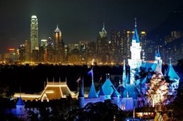
Here we go for the Main Street walk-through and we begin by the entrance and Main Street Station. On the top of this article, the Disneyland Paris Hotel located at the entrance of the park. Click on each picture to enjoy them in big size.
The back of Main Street Station, seen from Town Square.
The City Hall on Town Square.
Main Street Transportation Co, right in front of the City Hall on the other side of Town Square.
The Bixby Brothers shop, next to Main Street Transportation Co.
Main Street U.S.A Emporium entrance, at the corner of Town Square.
The other entrance of the Emporium, at the corner of Flower Street.
Two pictures of the Walt's Restaurant and Flower street.
Market House Delicatessen, in front of the Walt's on the other side of Main Street.
Main Street Motors, right in front of the Market House Delicatessen.
The Market House Delicatessen facade is on the left, the picture was shoot facing towards Main Street Station.
The Gibson Girl at the entrance of Central Plaza.
Casey's Corner Restaurant right in front of Gibson Girl, also at the entrance of Central Plaza.
As you've seen the result is not that bad, specially considering that all of them were shoot very quickly. So, if some of you are interested to know more, these pictures were shoot with the Sony DSC-HX1 a small and light "bridge" 9.1 MP camera which has also a fantastic and extremely simple panoramic mode AND also can film in high definition 1440 x 1080! Here is the Sony page about it, the price in the U.S is around $399 on Amazon.com which is reasonable if we consider all the features of this digital camera.
Thanks to leave a comment or discuss this article on D&M english forum on Mice Chat
All pictures: copyright Disney and more
Tuesday, April 6, 2010
The Disneyland Paris that never was: Part Three: Main Street U.S.A
Here is the part two of the "Main street that never was" article, always with the brilliant comments of Main Street show-producer Eddie Sotto. We saw yesterday the 1920's Main street concept but other concepts not necessary linked to this 20's version were also never realised, and i asked Eddie more details about some of them, beginning by the one above.
"After the park opened, there were proposals to add more new experiences. Between the entrance to the Discovery Arcade and the Camera Store is a façade that we were going to renovate into what you see here. This was bringing the multiscreen history of silent film to Main Street. I knew this was a very hard sell, but I am personally passionate about silent and early film. Keaton, Linder, Chaplin, Louise Brooks, George Meiles and more would be on going in this exhibit. There would also be handcranked Mutoscopes and other machines that guests could look into and experience early film. Of course, there was no way anyone would want to do this. So we have a sketch to remember it by! I would've loved to see this come true. There also was an evolution of this idea that was a video store except the videos were previewed by turning a crank on the antique Muto scope machines. The name "Buffalo Nickel" arcade was first coined at Knott's Berry Farm where I had worked years earlier.
Below, this is the concept where a video store has demonstrations of coming Video attractions in the movieolas. You could crank the chapters of the video forward and back by using the handle so it really was a way of sampling upcoming movies. This was to go between the camera store and the Discovery arcade facing town square. I thought this might work, but they never went any further.
This next sketch was intended to depict what would happen if we decorated the interior of the Main Street Transportation Company. This may have been done after opening as an enhancement. Ever since we first designed it, the Main Street Transportation building was intended to display the live horses that pulled the trolleys. Being able to go in and pat the horses would be a very nice payoff to such a dominant building.
The original intent at the end of market Street - rendering below - was to cross the arcade and go through three arches which would take you outdoors and they are would-be wagons with all kinds of things to eat. This area still has arches and doors so at some point you could create a courtyard and do food carts out there. What's the point of having a market Street without an open-air market? So in this sketch I showed people in the arcade and then sunlight leading to the far left of where market Street would enter.
Barbara Wightman did this next drawing and I believe it was primarily intended to be a concept for a bakery and was very early in our interiors explorations.
This rendering depicts a 1876 "Crystal Palace Exposition" type entry sequence. This would be a giant glazed ticketing complex and ironically, the cost of this is what drove us into subsidizing the coverring of ticketing with a hotel. At one time we even had the Crystal Palace restaurant from Walt Disney World as part of the Main Street program. I think it went away early on and perhaps this sketch was my way of getting it back in on a grander scale. It's hard to remember.
This is one of my favorite Herb Ryman paintings and probably the best Main Street piece of art. He decided to depict the ground-level of the elevated train station in Town Square. Herb always focuses on what people are doing not what the architecture is doing. In this image something has just happened offstage as the policeman's attention. You'll see dogs, people interacting and all kinds of "business". An artist named Tony Sarg did illustrations of New York City that were all about the people and Herb brought the book to work to say that's what he wanted to do to make the Main Street renderings more interesting. And of course anything Herb does is interesting. So beneath the El Station you would have merchandise and other vendors.
This next image is the Fire Station for Main Street and because it was not a revenue-generating location it was cut and instead the Storybookstore replaced it. It was based in part from the Staten Island Ferry Building in Manhattan. Carpenter Gothic is the style.
The artwork below depicts a crystal piano that was designed to rise up out of the ground and form a gazebo. I always loved how the Rock 'n Roll band "grew" out of the ground at the Tomorrowland Terrace at Disneyland. It would be so beautiful to hear distant piano music and then see a glowing, Crystal Steinway rise up in the middle of the Restaurant! This was the centerpiece of our Crystal Palace Restaurant at the Hub. Later the Plaza Inn replaced the Crystal Palace because it was less expensive to build.
This next painting was an early concept for City Hall. Eventually the design of the double columns and rotunda ended up as the interior of Harrington's China store.
This next artwork was done by artist and friend Jim Michelson, best known for his spectacular attraction posters and discovery arcade posters. He did this sketch of the forecourt area.
This artwork by Carol Grosvenor is a early concept for the StoryBook Store. It was before it became a small library theme, inspired by the film "the music man". But Tiger, in the booth, was kept in the final version.
The artwork below, by Nina Rae Vaughn, was to show the San Francisco feel of the Market Street as a concept. We did keep the look and style although these are not the facades at all. Market is also a famous street in San Francisco.
This artwork, also by Nina Rae Vaughn was more of a piece of marketing art for what we were building. We had already done most of the design at that point.
This last sketch shows the Photo shop and the photographer office but the final result is slightly different. I did this to give the buyers the exact density of props, their type, and direction for placement and buying. From a sketch like this you figure out the lighting, furniture, wallcovering and more. "The office" was moved from behind the counter - which became the darkroom - to the niche closer to the street so more guests can see it.
These "Main Street that never was" articles ends with this artwork from Eddie. Again, all my thanks to Eddie Sotto for his great comments on all these amazing concept-arts, it was fascinating!
Thanks to leave a comment or discuss this article on D&M english forum on Mice Chat
Artwork: copyright Disney enterprises Inc.
The Disneyland Paris that never was: Part Two: Main Street U.S.A
This part two of the "Disneyland Paris that never was" articles series is all about Main Street U.S.A. It’s not very known, but at Disneyland Paris we were at two fingers to get a really different design for Main Street U.S.A. Instead to have a “turn of the century” theming, Eddie Sotto - show producer of the land - had designed a Main Street set up in the 20’s-30’s with of course a totally different look.
WDI Imagineers felt that a Main Street with the theme of Jazz Age America in the 1920's would be more appropriate than the Victorian Architecture that had come from Europe and would therefore be of less interest. Everyone in Europe was fascinated by stories of the Roaring '20s… jazz, Cinema and, of course, Gangsters. They headed a long way down that route and according to Eddie Sotto this version of Main Street would have include "lots of Art Deco, an America as represented by the Chicago and New York seen in the movies. "It seemed to us that this would have been more representative of America in European eyes, as opposed to the Main Street inspired by the small township of Marceline, Missouri. The way we looked at Gangsters, was more of the slapstick comedy "Keystone Kops" variety with fun instead of guns. Walt was able to make Piracy and cowboy outlaws fun, so we thought we could make a "Speakeasy" fun too, without the violence."
Eddie Sotto give us more details about this amazing Main Street concept that never was and all comments with each picture of this article are from Eddie himself, whom i thanks a lot for his very kind contribution:
"In this version inspired by the '20s, each shop reflected the personality of an immigrant to the United States. An elevated train ran along the facades on one side of the street. After reaching the station in front of Discoveryland, the land of visionaries, it came back to Central Plaza, in front of the Castle, passing in front of a Vernian diorama on the return trip.
The top rendering shows the elevated train just above the entrance from Market Street looking south, to the left would be the entrance to the theater that has a circle vision type screen or similar that would tell the history of Hollywood and early film. This circle-vision cinema was disguised as one of the grand classic cinemas of the time, but the concept went away very early in the process because the determination to build a studio as a second park would duplicate that experience. The elevated train as we see it , would also look into windows that depict a "City of the Future" as Victorians imagined it. This was to be a Discoveryland transition.The posters in the hallway of the Arcade are the last remnants of that idea.
This view above shows an overlay sketch of mine to show EL Train, which was more of a "Peoplemover" system with many cars. One of the purposes of the elevated train is to provide a way for people to watch the parade while being under shelter during the rain. The elevated train was to extend to the entrance of Discoveryland to allow guests to circulate without getting wet.
On Main Street, instead of Walt's - an American Restaurant, we put in a "Speakeasy', one of those clandestine bars that sprang up due to prohibition. The guest would enter a relatively innocent looking flower shop, but a minute later the walls would revolve to reveal a 'Cotton Club'-style jazz hotspot.
The sketch above was done by Herb Ryman. We wanted to do a diner that looked liked the famous Edward Hopper painting "Nighthawks". This is where Walt's restaurant is now. The "Speakeasy "is next door on Flower Street, see the orange awning. We kept the "signs on the roof idea"and forced perspective distant buildings for Main Street Motors.
Another sketch by Herb Ryman showing the Diner again and the beige awning is the Speakeasy. I loved this sketch.
The painting above by Herb Ryman shows a design proposal for the castle as well as the Main Street elevated tramway. I think he painted Legend Dick Nunis in the foreground with a kid on his shoulders. He used to bury Executives in his paintings.
The painting above was done by Disney legend Collin Campbell. I was wrestling with the design of the 1920's being overlaid onto the existing Main Street. It was no easy task and in many ways looked conflicted. The elevated train station which looks just like the one in the movie "Hello Dolly!" was set on Town Square at a 45° angle. This allowed one block of Main Street to also be positioned that way as well. The Emporium was to be in that block behind the El Train Station so exiting guests would be let out into the upper floor of the store and trickle down. The Gas Station was to be where the Firehouse is currently located. The reason we put a Service Station into the project was because the transition from horse-drawn streetcar to automobile had already been made and the automobile had won.
I was never entirely satisfied with this rendering. The angle, composition, colors, even the scale just felt wrong. Herb Ryman had taken a few stabs with very loose sketches and I felt that they were very much on target. But it was taking a long time to get finished renderings that really depicted the project, so we went with Colin on this particular view. And it took this view and putting the elements together to really show us what kind of work still had to be done. We should have given Colin a better direction to work from. It really made me nervous because there was so many façades that had become ingrained in our consciousness from Walt Disney World, that the addition of these new elements even if they were perfect would seem like a clash. At this point it just wasn't working the way I had hoped. We would have to massage the transitions between Art Deco buildings and 19th Century buildings. We would have to go back into the Victorian designs and simplify them somewhat to make the gap less glaring. We never got that chance as the land was judged and declined while I was on vacation. Note to self... Never go on vacation! In hind sight, do I think the 1920s theme was the right thing for Paris? Yes. A year after he had declined the design, Michael Eisner said to me that we should have done the 1920's idea anyway because it would have been understood better in Europe. By then it was too late. I think in his mind, the 1920's Main St. was more expensive, so he was still happy with what we did and said so often. I don't necessarily agree with the story about him seeing the movie "The Untouchables", and that alone setting him off. I do believe because of the Circlevision Theater, the El Train, and all the Speakeasy Restaurant, it was only partly a creative issue and it was also a big financial issue. With that bigger number in mind it gave him the security to say no. Just an opinion.
The two images above and below were painted by Nina Rae Vaughn. Behind The Town Square East block of buildings there was to be a private restaurant for the sponsors of the park. This idea was first pioneered with club 33 at Disneyland. We would have a secret entrance underneath the railroad station that would lead you to a hidden terminal and in that terminal we would have an American-style streamlined locomotive train complete with dining cars that is inspired by the famous "20th Century Limited". There was a restaurant in Southern California that was this idea and it was absolutely gorgeous but did not survive. We thought this could be the most unique private restaurant in Europe. Europe has the Orient Express as its legendary train. In America the equivalent would be the 20th century limited. I believe we also wanted to investigate projections outside the windows that would take you across the US as it looked in another time.
On the artwork below, this is the east side of Main Street where we had created a circular driveway and we actually wanted the Main Street limousine to pull up in front of the theater and that is where you would board it. Today the limousine is the only thing left of that idea. Herbert Ryman did a very nice painting from this point of view that was stolen from Imagineering and I don't believe they ever got a photograph of it. but I thought it looked really great. It's unfortunate that this sketch is all that remains.
The confusing thing about this next piece of artwork, is that we weren't sure where the façades are going to be yet so this sketch in fact represents the east side of the street not the West. The idea was to have this theater whether it'll be a live stage or a show about film.
The next artwork shows another view of the "circle vision" theater entrance. In this view, we ran the El tracks directly above the guests in the Discovery Arcade. As I recall, this was a very early concept sketch. I think the greenery was shown outside the glass until we decided to make it solid walls.
The artwork below shows the same arcade but with the current design. This drawing was done midway through design to help visualize the details that we were beginning to assemble. The gas lights and brackets all have the liberty motif so I believe this is pretty close to the reality.
Herb Ryman and I discussed Walt's fascination with dollhouses and miniatures in general. We talked about an idea called "Automata-mericana". We thought it would be fun to build animated miniature scenes that are based on the American traditions and set them in Main Street. We wanted to tell the story with images rather than words. For example, The Main St. Cinema would be an animated scene with tiny figures of kids playing in the aisles, couples "making out" in the back, and the Projectionist embracing his mop imitating Valentino's famous screen kiss. Eddie Johnson, (who in my opinion is an unsung Imagineering legend) worked with me on this and came up with lots of fun ideas for these animated scenes. He was one of our art directors and did a great job. On a business trip to Covent Garden, London, we saw an animated "Cabaret" of these small exhibits. They were highly creative, very funny and showcase the ingenious use of cams and handmade characters. The idea for the "Shrunken Ned" Automatic Prescription machine at Disneyland also was inspired by that British exhibit. I believe the location for this exhibit - rendering below - was to be between the Transportation Company and the Hat shop.
Another 1920's Main Street sketch, very early for a music shop. Looks like the work of Barbara Wightman. In the early development you have to do very loose concept sketches so they can throw a budget number at the project. So these designs are just for a feel of the level of quality and basic theme.
Below, just a super rough of a gas station concept based on some research imagery to make it less industrial and more victorian like Main Street. In the 1920's version we also wanted to sprinkle the facades with giant advertising billboards and have cars motoring up and down, to give some idea of the dynamic atmosphere in the United States at that time. These were the only two ideas that were saved for the final version.
This next artwork is an early City Hall concept, before we were made to do 10' wide continuous foul weather walkways in front of the buildings which drove the design in a new direction.
This next concept of a giant clock would have been in the Forecourt, in front of the park's ticketing.
We will end the part one of this "Main Street that never was" article with this last artwork from Eddie, and we'll be back tomorrow with other sketches not linked to the 1920's version. Again, all my thanks to Eddie Sotto for his great comments on this amazing concept, which unfortunately was never built.
Artwork: copyright Disney Enterprises Inc
Subscribe to:
Posts (Atom)


