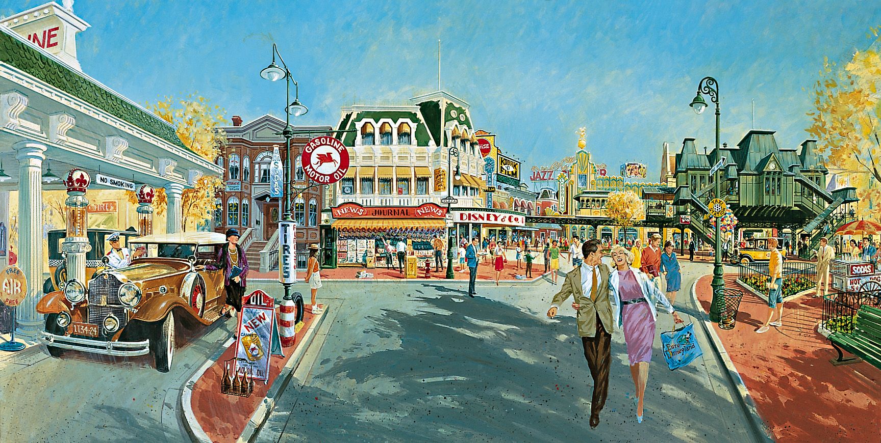
This part two of the "Disneyland Paris that never was" articles series is all about Main Street U.S.A. It’s not very known, but at Disneyland Paris we were at two fingers to get a really different design for Main Street U.S.A. Instead to have a “turn of the century” theming, Eddie Sotto - show producer of the land - had designed a Main Street set up in the 20’s-30’s with of course a totally different look.
WDI Imagineers felt that a Main Street with the theme of Jazz Age America in the 1920's would be more appropriate than the Victorian Architecture that had come from Europe and would therefore be of less interest. Everyone in Europe was fascinated by stories of the Roaring '20s… jazz, Cinema and, of course, Gangsters. They headed a long way down that route and according to Eddie Sotto this version of Main Street would have include "lots of Art Deco, an America as represented by the Chicago and New York seen in the movies. "It seemed to us that this would have been more representative of America in European eyes, as opposed to the Main Street inspired by the small township of Marceline, Missouri. The way we looked at Gangsters, was more of the slapstick comedy "Keystone Kops" variety with fun instead of guns. Walt was able to make Piracy and cowboy outlaws fun, so we thought we could make a "Speakeasy" fun too, without the violence."
Eddie Sotto give us more details about this amazing Main Street concept that never was and all comments with each picture of this article are from Eddie himself, whom i thanks a lot for his very kind contribution:
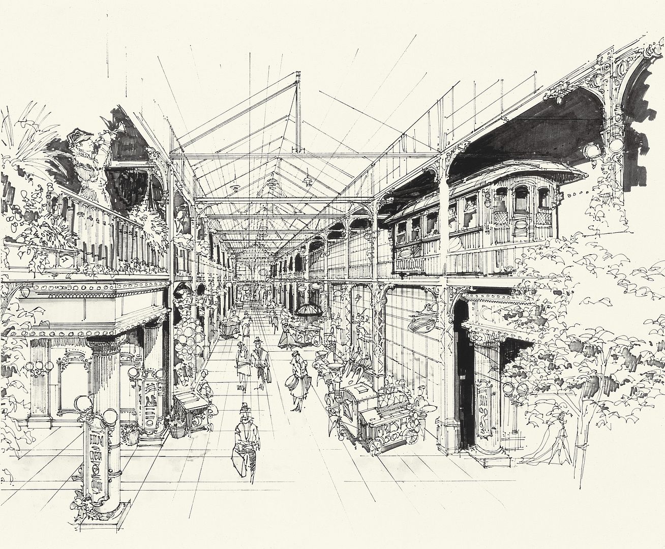
"In this version inspired by the '20s, each shop reflected the personality of an immigrant to the United States. An elevated train ran along the facades on one side of the street. After reaching the station in front of Discoveryland, the land of visionaries, it came back to Central Plaza, in front of the Castle, passing in front of a Vernian diorama on the return trip.
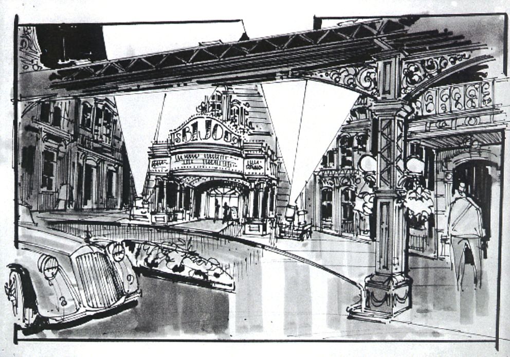
The top rendering shows the elevated train just above the entrance from Market Street looking south, to the left would be the entrance to the theater that has a circle vision type screen or similar that would tell the history of Hollywood and early film. This circle-vision cinema was disguised as one of the grand classic cinemas of the time, but the concept went away very early in the process because the determination to build a studio as a second park would duplicate that experience. The elevated train as we see it , would also look into windows that depict a "City of the Future" as Victorians imagined it. This was to be a Discoveryland transition.The posters in the hallway of the Arcade are the last remnants of that idea.
This view above shows an overlay sketch of mine to show EL Train, which was more of a "Peoplemover" system with many cars. One of the purposes of the elevated train is to provide a way for people to watch the parade while being under shelter during the rain. The elevated train was to extend to the entrance of Discoveryland to allow guests to circulate without getting wet.
On Main Street, instead of Walt's - an American Restaurant, we put in a "Speakeasy', one of those clandestine bars that sprang up due to prohibition. The guest would enter a relatively innocent looking flower shop, but a minute later the walls would revolve to reveal a 'Cotton Club'-style jazz hotspot.
The sketch above was done by Herb Ryman. We wanted to do a diner that looked liked the famous Edward Hopper painting "Nighthawks". This is where Walt's restaurant is now. The "Speakeasy "is next door on Flower Street, see the orange awning. We kept the "signs on the roof idea"and forced perspective distant buildings for Main Street Motors.
Another sketch by Herb Ryman showing the Diner again and the beige awning is the Speakeasy. I loved this sketch.
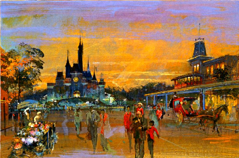
The painting above by Herb Ryman shows a design proposal for the castle as well as the Main Street elevated tramway. I think he painted Legend Dick Nunis in the foreground with a kid on his shoulders. He used to bury Executives in his paintings.
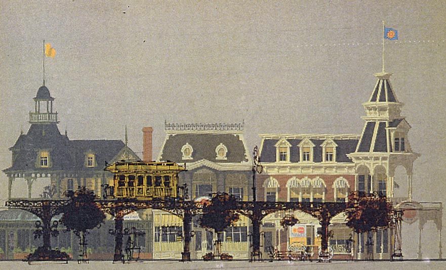
The painting above was done by Disney legend Collin Campbell. I was wrestling with the design of the 1920's being overlaid onto the existing Main Street. It was no easy task and in many ways looked conflicted. The elevated train station which looks just like the one in the movie "Hello Dolly!" was set on Town Square at a 45° angle. This allowed one block of Main Street to also be positioned that way as well. The Emporium was to be in that block behind the El Train Station so exiting guests would be let out into the upper floor of the store and trickle down. The Gas Station was to be where the Firehouse is currently located. The reason we put a Service Station into the project was because the transition from horse-drawn streetcar to automobile had already been made and the automobile had won.
I was never entirely satisfied with this rendering. The angle, composition, colors, even the scale just felt wrong. Herb Ryman had taken a few stabs with very loose sketches and I felt that they were very much on target. But it was taking a long time to get finished renderings that really depicted the project, so we went with Colin on this particular view. And it took this view and putting the elements together to really show us what kind of work still had to be done. We should have given Colin a better direction to work from. It really made me nervous because there was so many façades that had become ingrained in our consciousness from Walt Disney World, that the addition of these new elements even if they were perfect would seem like a clash. At this point it just wasn't working the way I had hoped. We would have to massage the transitions between Art Deco buildings and 19th Century buildings. We would have to go back into the Victorian designs and simplify them somewhat to make the gap less glaring. We never got that chance as the land was judged and declined while I was on vacation. Note to self... Never go on vacation! In hind sight, do I think the 1920s theme was the right thing for Paris? Yes. A year after he had declined the design, Michael Eisner said to me that we should have done the 1920's idea anyway because it would have been understood better in Europe. By then it was too late. I think in his mind, the 1920's Main St. was more expensive, so he was still happy with what we did and said so often. I don't necessarily agree with the story about him seeing the movie "The Untouchables", and that alone setting him off. I do believe because of the Circlevision Theater, the El Train, and all the Speakeasy Restaurant, it was only partly a creative issue and it was also a big financial issue. With that bigger number in mind it gave him the security to say no. Just an opinion.
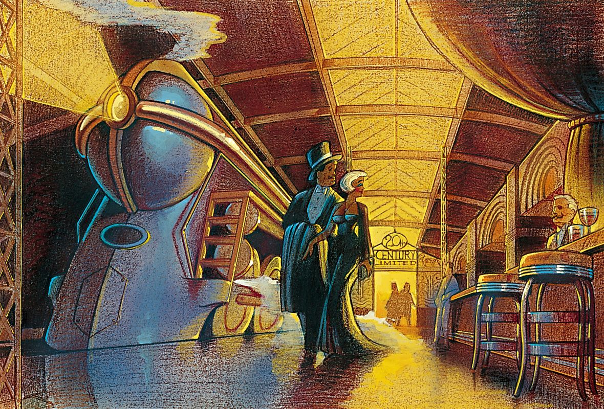
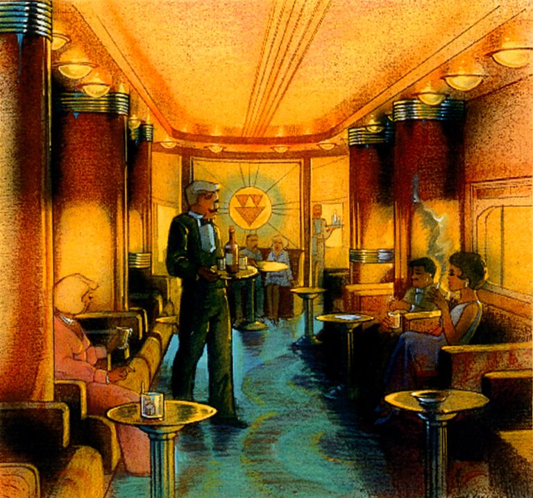
The two images above and below were painted by Nina Rae Vaughn. Behind The Town Square East block of buildings there was to be a private restaurant for the sponsors of the park. This idea was first pioneered with club 33 at Disneyland. We would have a secret entrance underneath the railroad station that would lead you to a hidden terminal and in that terminal we would have an American-style streamlined locomotive train complete with dining cars that is inspired by the famous "20th Century Limited". There was a restaurant in Southern California that was this idea and it was absolutely gorgeous but did not survive. We thought this could be the most unique private restaurant in Europe. Europe has the Orient Express as its legendary train. In America the equivalent would be the 20th century limited. I believe we also wanted to investigate projections outside the windows that would take you across the US as it looked in another time.
On the artwork below, this is the east side of Main Street where we had created a circular driveway and we actually wanted the Main Street limousine to pull up in front of the theater and that is where you would board it. Today the limousine is the only thing left of that idea. Herbert Ryman did a very nice painting from this point of view that was stolen from Imagineering and I don't believe they ever got a photograph of it. but I thought it looked really great. It's unfortunate that this sketch is all that remains.
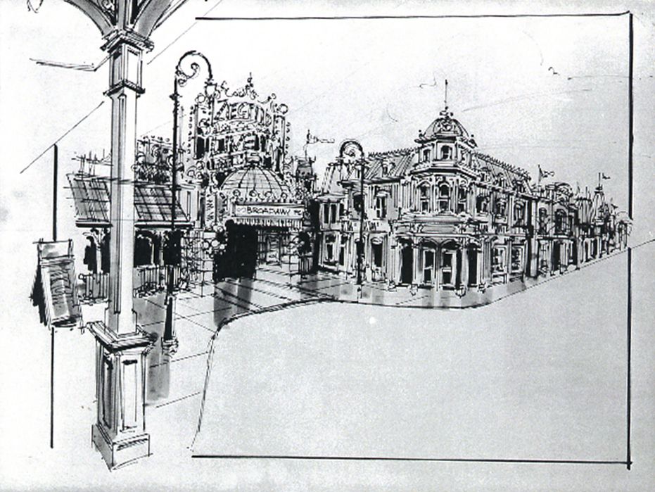
The confusing thing about this next piece of artwork, is that we weren't sure where the façades are going to be yet so this sketch in fact represents the east side of the street not the West. The idea was to have this theater whether it'll be a live stage or a show about film.
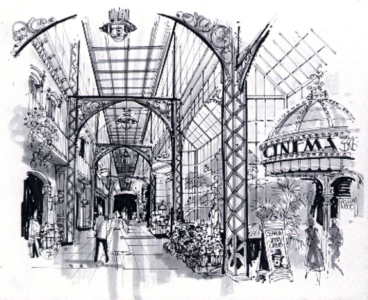
The next artwork shows another view of the "circle vision" theater entrance. In this view, we ran the El tracks directly above the guests in the Discovery Arcade. As I recall, this was a very early concept sketch. I think the greenery was shown outside the glass until we decided to make it solid walls.
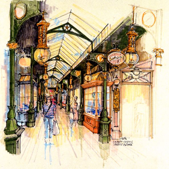
The artwork below shows the same arcade but with the current design. This drawing was done midway through design to help visualize the details that we were beginning to assemble. The gas lights and brackets all have the liberty motif so I believe this is pretty close to the reality.
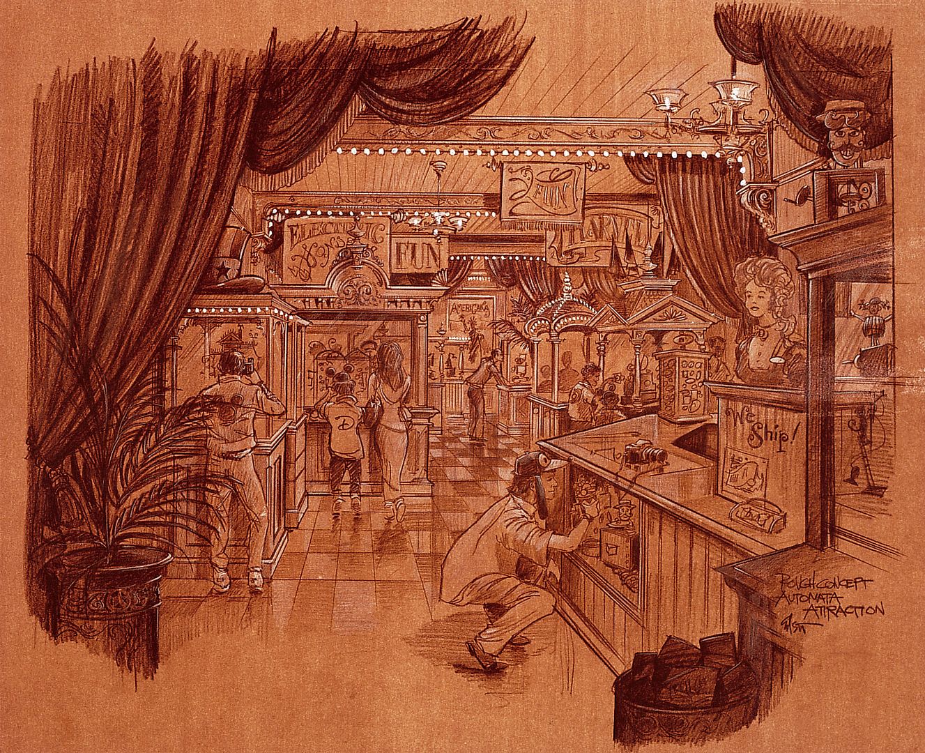
Herb Ryman and I discussed Walt's fascination with dollhouses and miniatures in general. We talked about an idea called "Automata-mericana". We thought it would be fun to build animated miniature scenes that are based on the American traditions and set them in Main Street. We wanted to tell the story with images rather than words. For example, The Main St. Cinema would be an animated scene with tiny figures of kids playing in the aisles, couples "making out" in the back, and the Projectionist embracing his mop imitating Valentino's famous screen kiss. Eddie Johnson, (who in my opinion is an unsung Imagineering legend) worked with me on this and came up with lots of fun ideas for these animated scenes. He was one of our art directors and did a great job. On a business trip to Covent Garden, London, we saw an animated "Cabaret" of these small exhibits. They were highly creative, very funny and showcase the ingenious use of cams and handmade characters. The idea for the "Shrunken Ned" Automatic Prescription machine at Disneyland also was inspired by that British exhibit. I believe the location for this exhibit - rendering below - was to be between the Transportation Company and the Hat shop.
Another 1920's Main Street sketch, very early for a music shop. Looks like the work of Barbara Wightman. In the early development you have to do very loose concept sketches so they can throw a budget number at the project. So these designs are just for a feel of the level of quality and basic theme.
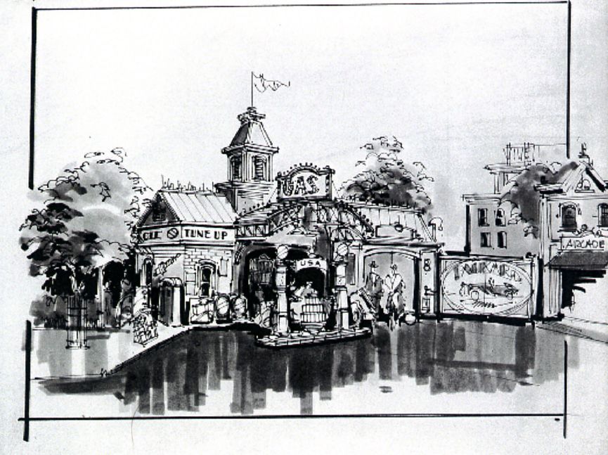
Below, just a super rough of a gas station concept based on some research imagery to make it less industrial and more victorian like Main Street. In the 1920's version we also wanted to sprinkle the facades with giant advertising billboards and have cars motoring up and down, to give some idea of the dynamic atmosphere in the United States at that time. These were the only two ideas that were saved for the final version.
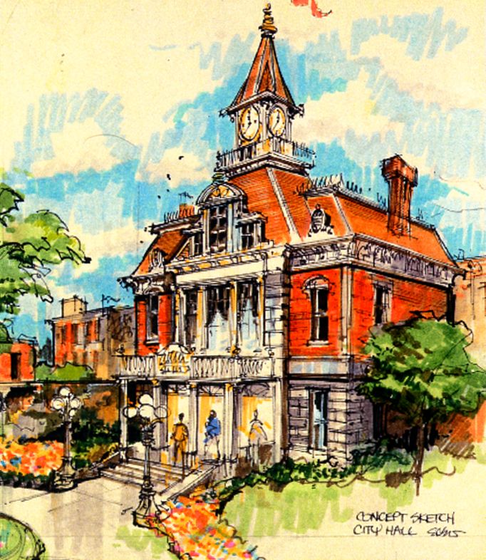
This next artwork is an early City Hall concept, before we were made to do 10' wide continuous foul weather walkways in front of the buildings which drove the design in a new direction.
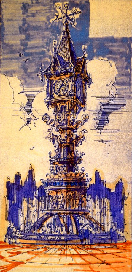
This next concept of a giant clock would have been in the Forecourt, in front of the park's ticketing.
We will end the part one of this "Main Street that never was" article with this last artwork from Eddie, and we'll be back tomorrow with other sketches not linked to the 1920's version. Again, all my thanks to Eddie Sotto for his great comments on this amazing concept, which unfortunately was never built.
Artwork: copyright Disney Enterprises Inc


4 comments:
The concept is absolutely beautiful, but very sad that it was never realized. DLP is special but going 20/30's would have given it a bold signature unique to the world. Maybe if so many hotels weren't built upfront, there would have been the budget and courage for the jazzy Main Street. And with all the resonance and excitement it would have stirred, maybe it would have given DLP the attendance figures it was craving back then (and now?) Ironically, giving reason for more hotels.
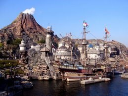
Luckily a lot of Eddie's design elements have ended up in Tokyo Disney Seas and have become a reflection of what Euro Disney could have had.
Wow! That was a fantastic article - full of new artwork & insights! Thank you!
I'd love to see these concepts be realised in WDS. The Art Deco designs would really fit in, and perhaps a ganster film-themed land?
Post a Comment