The Cars race rally attraction is normally what we can call a small “B” ticket attraction, but as we are going to see, thanks to a great theming , i give it a solid “C+” ticket, well deserved, and even a “D” ticket for the decors.
From the outside, you’ll see first the V8 cafe, but it’s a whole one-side-street of decor that have been recreated
Luigi’s Casa della tires and Tow Mater facades are there , and right in front of the neon lighted one of Luigis, the two characters from Cars are standing, which makes an instant photo location for kids.
All along the street telephonic poles as well as a tall pile of tires marks the border of this “Cars” district.
However, the entrance of the attraction of the attraction is made through another building, with a neon french title - quatres roues rallye - on the facade . from the window are displayed some painted car hoods , and right at the entrance , under a chrome luminary stands the famous piston cup.
To help you to locate where this is in the land, here is a picture of the contre-champ, shoot from the inside , looking towars guests come in. As you can see the Crush attraction is right in front , on the other side of the “road”, the Aladdin carpet ride being on the right of Crush coaster.
Let’s go on in the queue theming, now. First on the left, this “greeting from radiator springs” , followed by these other murals paying tribute to the characters.
A special room is dedicated to the Doc Hudson character, the one played by Paul Newman ( who was kind enough last week to reveal in an interview that Disney-Pixar have schedule the Cars 2 sequel for a 2009 release which seems to have infuriated some guys at Pixar! ) and you can even read some “Daily exhaust” front page talking about its former winning.
Other murals about Tow Mater follows, as well as an old genuine gaz pump and a map of Radiator springs.
Looking on the right is the huge painted back drop we show you before and a last mural for the Lightning mc Queen character.
And here you are at the turnstiles ready to embark. Just in front, as we saw, the Crush coaster building .
And on the right the now famous car-wing shape big red rock.
On the other side the Lightning mc Queen and Tow Mater “ full size” are standing, and their look is just perfect. However, if the one in front of Luigis are a photo location where children can come close to, it’s not the case here, as it is part of the ride decor. You can see or approach them ( without touching them ) from outside, but that’s different. Of course what must happen happened, when young boys exit at the of the ride they are running to Lightning mc Queen and Tow Mater to touch them, etc... forcing the cast members to urge them toward the exit. I’ve wonder why they’ve put them here and not outside, and i think it was to avoid children to climb on them and damage them , which would have been inevitable.
There is even a hidden Mickey on the Tow Mater character.
The ride itself , similar in some way to the lady bug ride at DCA is indeed a small ride, but really fun. The cars are spinning, moving from one plate to the next one, and the feeling that you are going to crash into another car - there is not more than 3 inches sometime between two of them , makes it really fun.
It is a small ride, but the whole theming makes it overstep our expectations ( i don’t remember that Disney ever spent so much money in theming on such a small ride like this one ) . However , if you’re not a kid, due to the small space inside the vehicles, you better loose some weight if you want to fit in. I’m kidding, but not that much, specially for the front row.
The exit is done through a path going behind the Lightning mc Queen and Tow Mater characters , in direction of “Crush coaster”.
And a billboard ask you why you’re “leaving so soon?” . Sure, we will come back soon.
There is more to see in this Toon studio. The toonis blue lamp post leads us to the Toon Town facade i show you in a previous article.
But this security office at the entrance has been installed since then . Have a look , too, at the toonish computer inside it .
On the left and right side of the Toon town 3D backdrop are two characters photo location, one with Mickey , and one with the Incredibles - here on the picture Mr incredible.
Surprisingly, no shop or restaurants in this new land ( and god knows that there is a lot of good theming ideas that could have been find around the Toon theme )
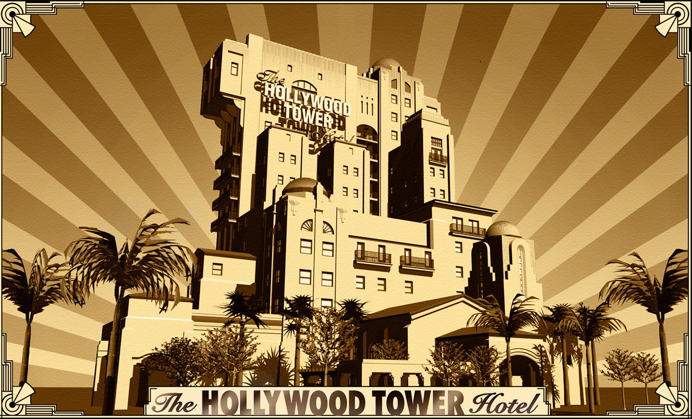
A new road now exist to exit the toon studio , and , as you can see on the picture, you have a great view on the upcoming Tower of terror.
Frankly, i really think that these new Toon studio attractions and placemaking
will bring back more people inside the WDS park, which is good, because the better the park will work, the sooner we will have new attractions.
Photos: copyright Alain Littaye and Disney


