Here is the artwork article of the week, and it's going to be a great one, as i am doing a grand tribute to a hlghly talented artist: Eric Heschong.
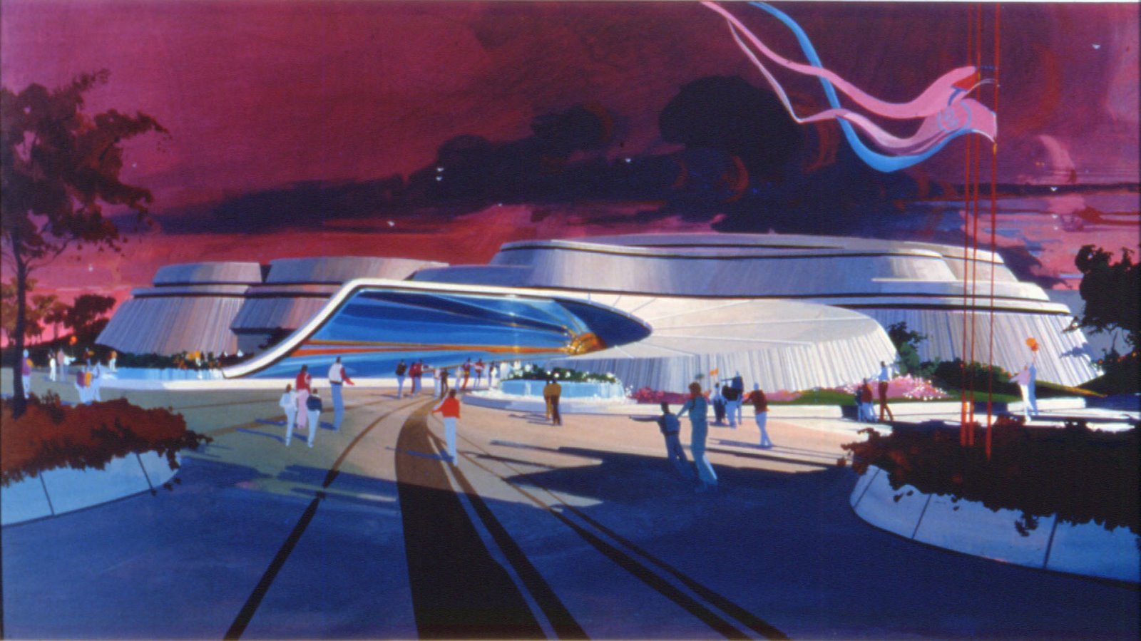
I love Eric's artwork since ten years ago when i've discovered some of his artwork for Walt Disney Imagineering, and you all know it as i am talking about the fantastic Tomorrowland '98 paintings like this one below.

Now, today i am not going to show you the artwork he did for WDI, but other great artwork he did for Landmark Entertainment. And those of you who like to discover concept-arts of never realised projects will be in heaven today as lot of the paintings below are in this case. Better than that, i will also let you know at the end of the article how you can own some of them - yes, the "original" painting, not a copy or a print, and for an amazing price.
Let me tell you more about Eric first. Eric Heschong learned to paint at the now defunct Hanna-Barbera cartoon studios. Later, he worked doing tight architectural illustration. And then for Landmark Entertainment, a company specialised in attraction, theme parks and resorts or casinos design. if you don't know Landmark, it's them for instance who designed the Terminator 3D attraction for Universal Studios and the amazing Spiderman ride at Islands of Adventure. At Landmark, back at the end of the 1990's Eric worked with Chuck Cancillier who was the designer. Chuck would do pencil layouts and then hand them off to Eric for paint. Every so often, he'd be asked to do the layouts.
"Working for Landmark was a fun time for me." says Eric. "I enjoyed the work and tried to please. I used my portfolio from Landmark to get work at Universal Studios and Walt Disney Imagineering. Most of the work I did at Walt Disney Imagineering was for Tony Baxter."
We will begin by paintings which are part of Eric's portfolio. No need to say they are gorgeous.
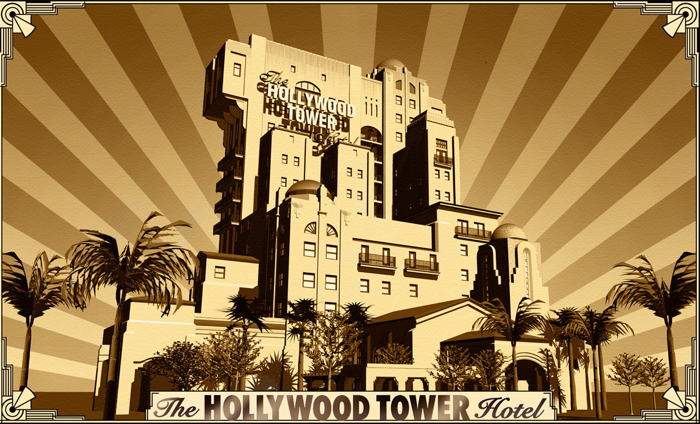
The first one, at the top of this article, is an "Emerald City" painting done for a Wizard of Oz park that was supposed to go in somewhere in Kansas. Landmark didn't mind that Eric's Emerald City looked nothing like the one in the movie. The header image is also an Eric's painting, for a Warner Bros concept.
This next painting with the purple rocket was for a Paramount Pictures park. A Willie Wonka attraction (on the right) and a Godfather's restaurant (on the left) were to be featured.

The two next paintings were done of course for a Star Trek attraction. I don't think these scenes/decors were realised but Landmark is the company who did do the Star Trek Experience in Las Vegas.


The next concept with this copper colored space station was actually built in South Korea.

This Bluto Bay decor was designed for a movie company who has or had the Popeye property - it might have been Universal.

Eric did also this concept-art for a James Bond "Licence to thrill" attraction. First, i thought he did it for a previous concept of the Walt Disney Studios "Motors, Action!" stunt show, as i knew WDI envisioned to do the stunt show on a James Bond theme. Then it was cancelled and i always thought it was for a rights/license problem, that the Bond license was too expensive, etc... In fact not, it's probably because Paramount Parks got the rights to do this "License to thrill" attraction. The attraction existed for real from 1998 in three or four diferent Paramount parks.

Landmark also designed Hotels and Casinos, like this 1999 ”Muwi Kingdom Hotel” concept for Inchon, South Korea.

This next bird's eye view was to be a casino/hotel called the City of Gold. It looks similar to the one above and may be it was done for the same concept.

The interior lobby would have been incredibly spectacular - i should say dazzling. That's the painting below, with the griffins.

The next concept-art with the movie theaters and trolley car was for a Navy Pier concept in Chicago.

This one too was done for the Chicago Navy Pier concept.

This 1998 acrylic painting shows a land called "Cartoon Ville" part of a proposal for a "Shanghai Movie Park" in China.

"Heavy Metal Island" is the title of this 1999 concept-art, the entrance to an island-Rolling Stones land in a proposed Rock theme park.

The two next paintings called "Metropolis Metro Entertainment Center" were done for a Shanghai Metro Entertainment Center.


The concept-art below show a "Nautical Sports Dome" for a Niagra Theme Park.

"U.S.O. with Bob Hope" is the name of the Cell Vinyl on illustration board concept below.

This next painting was for a "Rhythm and Blues Area" in a Grammy Exposition.

As i told you Landmark did lot of concepts for casinos. Here are some paintings that Eric did for these concepts. Let's begin with the Las Vegas Caesar's Palace and this concept-art for a 1995 "Caesar's Exterior Expansion".

The next one shows a new inside decor proposal for the Caesar's palace...

And this one, always at the Caesar's, is called "Casino of the Gods".

The next 1999 painting below is named "Secondary Gaming-Train Station", a proposed expansion of the Barona Casino in San Diego.

”Rooftop Casino” is the name of the scene below - obviously inspired by the rooftop of Paris Opera (where by the way i walked upon for real some years ago for a photo shooting!).

This next 1997 painting ”Monex New York Casino” was another kind of "rooftop" view for the Century City Monex.

"Starlight Restaurant Interior” is the title of the artwork below, designed for Phantom Phantasy Casino.

These two 1993 acrylic paintings were concepts for the Harrahs Hotel/CasinoLaughlin in Las Vegas. The first one is called "Harrahs Laughlin" and the next one "Plaza Scene"


Always for the Harrahs in Las Vegas, this last artwork is called "Mardi Gras".

Now, as promised, i will tell you how you can own some of these paintings. Landmark Entertainment actually put on sale most of their old artwork on two sites. The first one is the Landmark Selections site and the other one is on EBay.com where they have their own Landmark artwork store. All the paintings on this page after (and including) the second Chicago Navy Pier concept artwork are part of the sale. On Ebay they are not listed as auction but in "buy it now".
Eric Heschong paintings prices on the Landmark site are between $250 and $350 and ALL the paintings are originals, i.e one of a kind, NOT "prints". Considering Eric's awesome talent, this is amazingly good prices, and to give you an idea, if the same kind of paintings were done for WDI and sold by Disney they would cost at least ten time these prices. I have to add that Eric has nothing to do with this Landmark sale as the owner of the artwork is Landmark Entertainment who is as i've said the company who is selling them. If you love artwork, this is a unique opportunity to own some of Eric's gorgeous artwork. I want to add that these Landmark sale prices are NOT the normal prices for Eric's paintings.
Finally, i want to thanks Eric Heschong and Landmark Entertainment for providing me the pictures files and authorisation to post them in this article and i hope you now love as much as i do Eric's artwork!
Artwork: copyright Landmark - Eric Heschong - Disney Enterprises


