Saturday, February 28, 2009
Universal release new " Wizarding world of Harry Potter " Artwork
A little artwork for the week-end, as Universal has released on the "Wizarding world of Harry Potter" web site a new rendering showing the Dervish and Banges shop, located in Hogsmeade.
I remember you that the previous rendering released on the Harry Potter site was the one of the Three Broomsticks restaurant.
This highly-awaited new land of Islands of Adventure is always supposed to open in 2010.
Artwork: copyright Universal Studios
Friday, February 27, 2009
Carousel of Progress behind the scenes - Photos and Videos
Today, here is a tribute to one of WDI most famous Audio-Animatronics attraction. Of course, I am not going to tell you the story of the Carousel of Progress, as we all know everything about it.
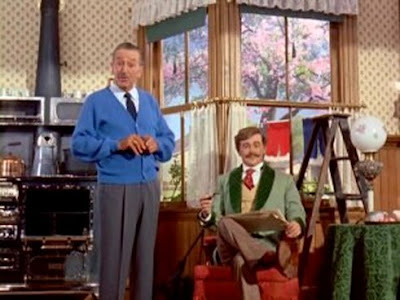
Instead, here is a pictorial report, with great pictures and videos, and Walt himself describing this beloved attraction.
The Carousel of Progress, it's also a song "There is a great big beautiful tomorrow" written by the Sherman brothers in a time where the hope in the future was stronger than today!
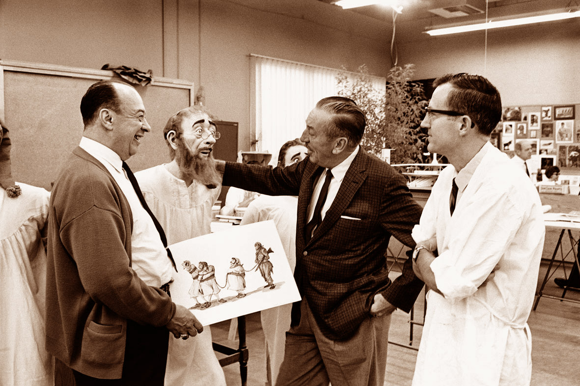
In the first video below, right after the Leonard Matlin intro, Walt is with the Sherman brothers rehearsing the song. And he stands near the model of the attraction which was going to open at the New York's world fair, General Electric pavilion.
But the Carousel of Progress was also the beginning of life-size audio-animatronic, and in this next video, Walt introduce them to the audience.
Here is an old Disneyland postcard showing the Carousel of Progress building in Disneyland.
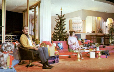
Here is now some pictures of the attraction, if possible in chronological order, as there is a chronology.
And now, for those of you who miss the attraction - but we all miss it, don't we? - here is a great video of the whole show by ru42.
But some of you may remember the OTHER version of Carousel of Progress, with a different song "Now is the time". Personally, this one was my favorite theme, and here is, in two parts, videos of this version, thanks to "magicalthemeparks"
For more facts about the attraction, have a look HERE
Photos and making-of videos: copyright Disney Enterprises Inc.
ru42 video: copyright ru42
Last videos copyright magicalthemeparks
Many thanks to ru42, magicalthemeparks, freedogshampoo and mfiles2000 for the youtube videos.
Thursday, February 26, 2009
Editor's Note: I saw the Watchmen movie this morning and here is the review! When you will be over with it, have a look at the Blue Sky Disney site as Honor Hunter has some interesting details about DCA's upcoming World of Coulour show!
Watchmen Review : The Movie adaptation of Alan Moore and Dave Gibbons Masterpiece
I saw the Watchmen movie this morning - it was the French press screening - and as promised, here is my review.
Watchmen is one of the most awaited movie of the year, and as i did explain in my previous post there is good reasons for that. Since it was published in 1986 all the fans of Alan Moore and Dave Gibbons absolute masterpiece are waiting for a movie adaptation. The graphic novel has been acclaimed by almost everybody who've read it and TIME magazine put it as one of the 100 best novels of the 20th century. I, personally am a huge fan of the Watchmen and i even read it again this week-end to make sure i will have the story in my mind when i saw the movie today.
Sooo, is it good or not? Is it faithful to the graphic novel or not? Yes it is good and faithful to the original graphic novel at, let's say, 90%. Zach Snyder is may be not as visionary as the movie trailers keeps repeating it, but he have enough vision - and love for Moore and Gibbons work to do a pretty good adaptation of the Watchmen.
The script adaptation of the original story is pretty incredible as it succeed to put almost everything which is in the 416 pages book in a 2h40 minutes movie. And this is done pretty intelligently. The only problem is that Zach Snyder didn't forgot too that he has an ego and authorized himself to change a major part of the plot - at the end of the movie - and, frankly, it is a big mistake which prevents the movie to be totally perfect. Let's see all this in details now, and i will tell you when there is spoilers so you can avoid them.
First, I must say that the casting is pretty good. The actors playing the Comedian, Rorschach and Nite Owl - Jeffrey Dean Morgan, Jackie Earle Haley and Patrick Wilson - are just perfect, they have the right kind of "energy" for each of their character. Dr Manhattan - play by Billy Crudup is fantastic. Although Manhattan's voice doesn't sound like the one i imagined in my head when i've read the story, his voice is great. And Malin Akerman who play Laurie Jupiter / Silk Spectre II is pretty good too. Most of the actors playing supporting roles are also okay. Then we have the Ozymandias character play by actor Matthew Goode. Matthew is doing his best, there is no question about that, but physically speaking - and also because Snyder's has "pushed" probably too much the homosexual side of the character - he is the one who looks the less to the Ozymandias we remember.
Almost all of the major scenes of the book are in the movie, brilliantly recreated, with the same "frames" one can see when he read the graphic novel. The dark side of Alan Moore's story is still there and Snyder had also the intelligence to keep the "sex scenes" of the book including Dr Manhattan full frontal nudity. Once again the first 2 hours and twenty minutes should fill with enthusiasm all the Watchmen fans. At least until we arrive in Ozymandias Antartica fortress.
WARNING! From now, there is spoilers ahead. If you've never read the book and don't know the story, it's better you stop reading my review here.
In the original storyline - which for a big part is a typical whodunnit story - the Ozymandias character try to save the humans from an inevitable nuclear war. Ozymandias incredibly sophisticated - and machiavelic - plan includes the teleportation in New York of an alien monster that will explode - and half of the city with him - when he'll arrive "at destination" in NY city. The monster - built in fact by a team of scientist and artists had his brain created from the cloning of a powerful medium's brain. His teleportation in New York created mechanisms inside the huge creature's brain and the psychic shock wave was killing half of the town. Mediums all around the Earth would have nightmare for years and everyone on the planet would not doubt that Earth had encounter a so dreadful force that nations will unite forever to fight it.
Now, in Zach Snyder's version, no more alien monster, it's Dr Manhattan who is supposed to be responsible of the destruction - not only of New-York but also Paris, London, Moscow, and the world major cities. He don't really do it, it's Ozymandias who did it and he did it in a way that the world think it's Dr Manhattan who is responsible. No more "cloned" brain, no more psychic shock wave and no more years of nightmare for mediums!
And this is where is the problem. Alan Moore's genius is coming for a big part of his knowledge of the world of the thought. Alan Moore KNOW that it is not "money" or even human being which are really ruling the world, but MENTAL IMAGES. And all the genius of Ozymandias plan was there. What was happening in the original story was going to create mental images so frightening that it would change the world forever. Because in fact it is the ONLY way to change the world, even in our real "reality". The depth of Moore vision made the beauty of the story.
Unfortunately, Zach Snyder decided to change all this. In interviews, he keeps repeating that the "giant squid" look of the monster in the original story was too "kitch" for a 2010 movie. Okay, so why didn't he create another look for the alien creature? Hollywood is creating tons of them each year for other sci-fi/horror movies and everybody like them, right? Also, why being so faithful to the original script during 2 hours and 20 minutes and suddenly change his way? I suspect there is an ego problem somewhere. Snyder could have done a perfect and humble movie adaptation of the graphic novel but he had to "exist" somewhere. And Alan Moore's script and vision is so precise that there was no way for Snyder to exist without changing the script at some point. God damn', Snyder: when you have a perfect story, you don't change it! It could have been a perfect movie if he didn't screwed the end. If he had been totally humble. Watchmen is without any doubt the best adaptation from a Moore novel and i had pleasure to watch it 90% of the time, but Watchmen fans will scream about this new ending on the forums for years, and this time it will be because a huge alien monster DIDN'T explode in New York!
Snyder is a talented director, no doubt about that. And some of the changes he did are not all bad, but I'm sorry Zach, you can't compete with Alan Moore's vision.
Picture: copyright Warner Bros
Libellés :
alan moore,
dave gibbons,
watchmen movie,
watchmen review,
zach snyder
Wednesday, February 25, 2009
Disney's Animal Kingdom Original Artwork - Part Two
Here is the awaited part two of the Disney's Animal Kingdom original artwork article , and if you've missed the part one you can find it HERE. Above, a great artwork showing different elements of the park!
We're back in Asia and we begin by Expedition Everest artwork! Below, a beautiful Dan Goozee concept-art.
Next, another early concept by Chris Turner showing the Tibetan temple where the train goes through on the first lift.
The most famous of all Expedition Everest artwork, as it was the one chosen when the announcement was officially released.
Below, a Ray Spencer rendering showing the village of Serka Zong.
A rare rendering showing the beginning of the Expedition Everest ride.
This next one, an early concept by Chris Turner shows a never-realised scene, and all i can say is that i regret it as it looks really great!
Below, a beautiful painting by Joe Rhode of the yeti.
This Chris Turner concept shows a giant yeti. There is still a first encounter with the yeti and projection effect, but the size is smaller.
There is one more early concept for this ride scene with this Joe Rhode painting.
Just like in the part one, you will also find some pictures of the imagineers at work. Here a WDI imagineer is working on the tea train locomotive model.
A close shot on the locomotive itself.
It's time to move inside Dinoland, U.S.A and this first rendering is a Joe Rhode early concept for the Boneyard.
Here is another one by James Wong, closer to the final result. Note the coaster in the back. It was never build and should have been called "The Excavator"...
But i've found for you a rare rendering of it!
Next is an early concept by Chuck Ballew for Dino-Rama!
A "Triceratops Spin" concept by Victor Post...
...and another one by Jenna Goodman.
Below, a Dinoland entrance concept-art by Tom Gilleon.
Here is a rendering showing the entrance of the "Dinosaurs" ride - formerly known as "Countdown to Extinction".
This next painting was released as a postcard at the park's opening.
A rare rendering showing the ride vehicle and the dinosaur to be rescued.
The Carnotaurus attack is the climax scene of the ride.
These next three renderings are particularly interesting as they are showing scenes that were NOT realised. This first picture by Joe rhode seems to indicate that at one point the attraction was envisioned as a walk-through, or at least a part of the attraction.
And this velociraptor attack never happened too.
This next one shows a gorgeous scene that we can regret, and i have a story about it: In 1997 or so i was at WDI for a series of interviews and in the office of a an imagineer friend i saw this painting. I asked him if it was in relation with Animal Kingdom - not open yet at that time. He answered me that it was indeed for the "Countdown to extinction" attraction and that "we would be lucky if it looks like that at the end...". He was unfortunately right, and this leads me to the biggest problem with "Countdown to extinction" - now "Dinosaur": the cuts in the budget. Personally, i still like the attraction, and i quite liked it the first time i've ride it, but when you see this kind of concept and know how great it could have been, you really not in the mood to thanks the suits who were Disney executives at that time. One more Michael Eisner "mistake" - and i'm kind - that we still regret today.
The next picture shows a WDI imagineer at work on one of the dinosaurs that we can see in the first scene - it's the one "eating" a smaller dinosaur.
The two next one are showing imagineers at work on the Carnotaurus or programming the Audio-Animatronic.
Theater in the Wild is also in the area, and the next rendering was done for "Nemo, the Musical" show.
Now, there is a land that we all regret that it was never built: Beastly KIngdom. When Animal Kingdom opened, even the Beastly Kingdom land logo was at the entrance of the park and renderings of it were printed in the AK making of book. And then, we know what happened: this Beastly Kingdom project disappeared and chances to see it built one day are more than low. Thanks god, the artwork still exist, and here are some of them just to dream and see how good it could have been.
First, a bird-eye view of the whole land.
The castle, supposedly inhabited by a dragon...
The next artwork shows the labyrinth - the maze...
..and this is one of the mythical animals - a Griffin - that guests would have encounter.
The goal would have been to find the Unicorn, in a grotto at the end of the maze.
And a Fantasia flume ride wold have delight young children.
Let's not forget the dragon firing at the river cruise boats.
This Animal Kingdom article won't be perfect without some renderings of the Animal Kingdom Lodge. Here are two of them showing the entrance and the lobby.
While we're here, i join two other renderings of the Disney Vacation Club Animal Kingdom Villas.
That's the end of this Animal Kingdom artwork article!
All artwork: copyright Disney - WED Enterprises.
Many thanks to Mark Taft for some of the renderings. I strongly suggest you to have a look on Mark's site Insights and Sounds, it's always interesting with rare pictures or renderings and Mark is posting new articles almost every day!
Some of the renderings are coming from the great "Imagineering Field Guide to Disney's Animal Kingdom" where you will learn all the WDI secrets in the making of the park. It's a "must" and you can find it on Amazon.com from only $3.87!
Some other pictures are coming from Jason Surrell's fantastic book "The Disney Mountains", full of WDI artwork. You can find it on Amazon.com from only $8.90 and it's also a "must"!
Subscribe to:
Posts (Atom)