
Here is the part two of my Don Carson artwork tribute! Last time we saw Don's artwork for Mickey's Toontown and Splash Mountain and after the opening of both Splash and Toontown, Don continued his work as a Senior Show Designer on various projects, including Disney’s America, Blizzard Beach, Tokyo Disney Sea, Typhoon Lagoon enhancements, and many more. Here is some of his artwork for Disney's Blizzard Beach.
Above Don Carson artwork for Blizzard Beach tower rental building.
Blizzard Beach was created as an alternative venue to the very popular Typhoon Lagoon. Don worked with various artists, including Hani El Masi, to develop a style internally called “Alpine Floridian”. This was a mix of tropical Key West design elements and the Swiss architecture you might find in a sky village in the Alps. Don created concepts for two Blizzard Beach fast food location. One was called "Avalunch"...
Don did also renderings for two Blizzard Beach fast food location. One was called "Avalunch"...

And the other one "Snack Shack".

Over the years, some of Don's very favorite jobs at WDI was creating quick concept sketches for Walt Disney World's “enhancements program”. These were small budget projects that were initiated to constantly improve the experience of existing parks. Each year a team of Imagineers would visit each of the parks and sketch up their best improvement ideas. These were often based on the needs of the park's Operations Department, but allowed for a lot of self expression on the part of the Show Designers. In the below example, "Let's Go Slurpin'“ was a concept for a two story food facility that would have been located in Typhoon Lagoon.

Or this fun photo location with Laguna Gator...

And also these "Tips/Events boards".

In the mid 1990’s Don moved his family from Los Angeles to Eugene Oregon to continue his design work for not only companies like Disney, but branch out to include work on computer games, interior, and product design. In early 2000 Don began working with various start-up companies in California's Silicon Valley. Here he worked to bring his knowledge of creating physical themed environments to the virtual world, and to the computer screens of a world wide audience.
Below is some of his "post-Disney" artwork for There.com. “During those initial years,” says Don, "I had the opportunity to work as the Art Director leading a team of artists designing the virtual world of There.com. There is self described as "A place where you can engage your imagination by enjoying shared experiences with others online". For me the work has touched every aspect of my artistic training and allowed me to be a land developer, graphic illustrator, and theme park designer all in one project."
During the next four years, Don created hundreds of concept sketches used as the basis for virtual 3D environments. Since this was such a new industry, the designers had to learn as they went along.
The first rendering is of a Tiki village concept...

This one below show a Tiki bar concept...

And this one "Tiki Pete's Shirt" is a retail huts idea.

Below, a "Salty Dog Tavern" concept realised for There.com

Here is a book kiosk concept, always for There.com

...and the final 3D rendering of it.

Always using the 3D computer rendering technique, some other artwork for There.com


Don's work has come full circles as his designs for WDI put to use this computer design technique: "In recent years I have used the computer more and more to communicate concepts to my clients. After leaving Disney I desired to find a happy marriage between my conceptual, theme park, and theater design work via 3D computer design. As computers have become more powerful the potential to deliver concepts that are very close to the finished product is growing. Computers have also allowed me to work from my Oregon studio while remaining connected virtually to clients all over the world."
It's with this technique that Don did these early WDI "computer aided" concepts for Toy Story Mania! First, here is a "traditional" 2D black and white sketch...

...and the final "computer designed" 3D rendering.

Always in 3D, a Toy Story Mania show set facade.

You may have notice that on these two 3D renderings the vehicles don't look as they are in the final version, as these were early concept. But if you look again at the Monsters Inc Ride and Go Seek photo report posted laast tuesday, you'll see that the MOnsters Inc vehicles looks exctly like Don's early TSM vehicle concept above! one more proof that at WDI "a good idea never die"!
Below, another 3D Toy Story Mania rendering for a cannon concept.

"The past few years have been an adventure as I work to bridge the gap between concept and final product. Conceiving in 3D has allowed me to marry my design sense with tools that I can use to visualize an idea as close as possible to its eventual implementation." says Don. One thing is sure, these 3D renderings look absolutely great, i love them!
Don continues to work in the theme park industry for Disney, Universal, and other design firms, and always strives to bring a “Disney” sensibility to all of his work.
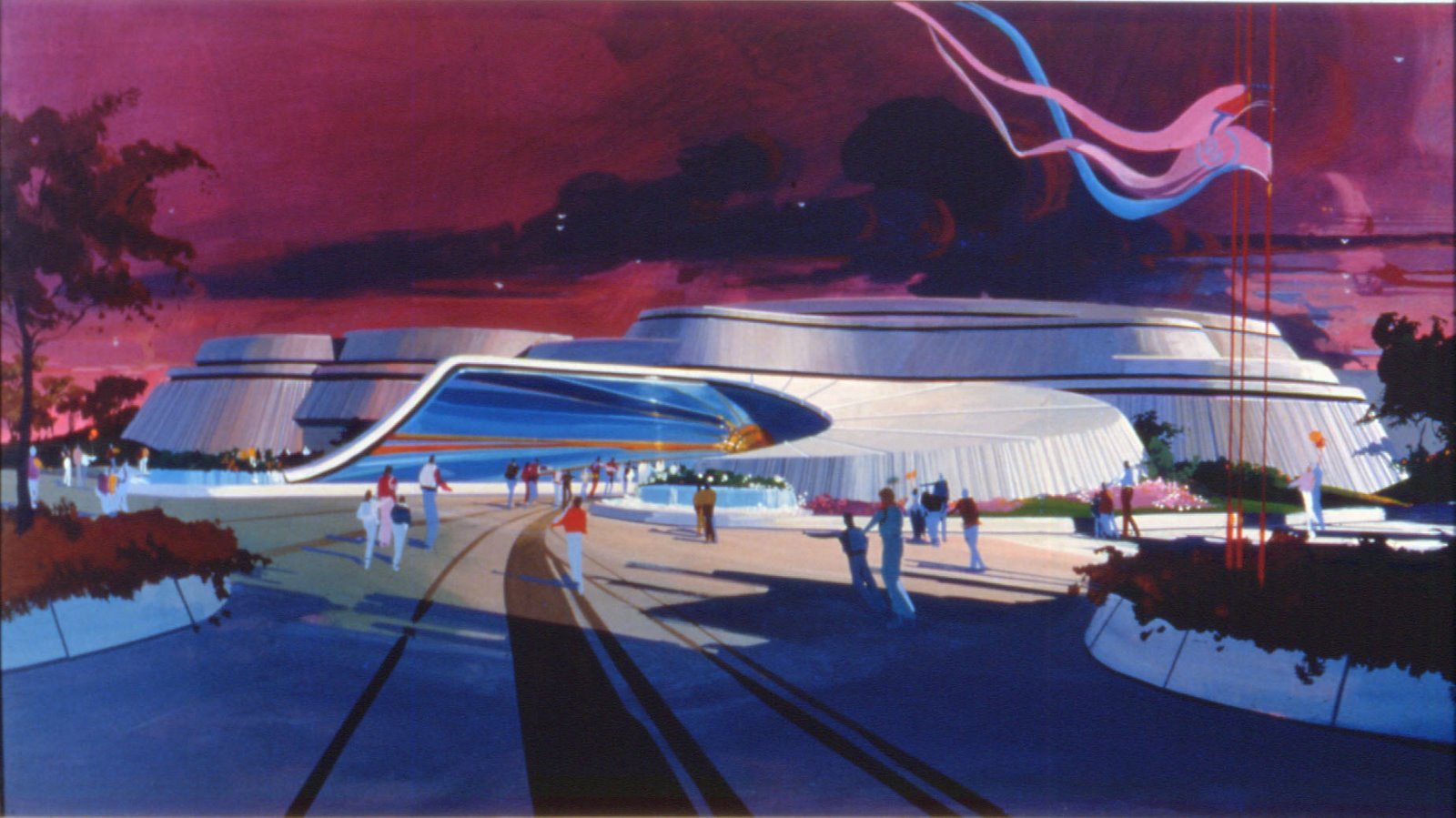
These last images below are some of Don's most recent work. By combining his experience as a theme park, video game, and now virtual world designer, Don is always working to push where environmental storytelling can take an audience. With luck you will see some of that Disney influence in these images as well.

For more information on Don Carson’s work, please visit his website at:
www.doncarsoncreative.com where you will discover many more fantastic artwork from Don!
Also, if you like Don's artwork, i strongly recommand you his book called "SKETCHBOOK: Concepts from the Virtual World" available on Amazon.com and even for the Amazon Kindle! It's probably one of the first sketches book available for Kindle, very affordable - $3.16 - and if you own a Kindle, you will enjoy it immediately as you download it from Amazon!

I hope you enjoyed these articles about Don Carson artwork, and i send my best thanks to Don for his precious help in the making of these articles.
Artwork: copyright Disney-WED Enterprises , Don Carson, There.com













4 comments:
WOW! Just amazing stuff- I can tell you from visiting Manhattan Beach Creamery, which Don designed, his beautiful pieces translate into beautiful spaces as well. Nice post!
Mark
www.InsightsandSounds.blogspot.com
yeah, I sound like a broken record here, but it's all just so amazing! Don's process and style is really, really, great!
thanks alain!
As an 'old time Imagineer' I recognize some of the early work in this post. But it's so refreshing to watch the evolution of Don's work, and his flawless transition from hand painted artwork to computer 3D. Great work, Don. Keep it up ! And all the best.Your Toon Town comrade, Hani.
just one word: AMAZING!
Post a Comment