Here is the part two of the "Main street that never was" article, always with the brilliant comments of Main Street show-producer Eddie Sotto. We saw yesterday the 1920's Main street concept but other concepts not necessary linked to this 20's version were also never realised, and i asked Eddie more details about some of them, beginning by the one above.
"After the park opened, there were proposals to add more new experiences. Between the entrance to the Discovery Arcade and the Camera Store is a façade that we were going to renovate into what you see here. This was bringing the multiscreen history of silent film to Main Street. I knew this was a very hard sell, but I am personally passionate about silent and early film. Keaton, Linder, Chaplin, Louise Brooks, George Meiles and more would be on going in this exhibit. There would also be handcranked Mutoscopes and other machines that guests could look into and experience early film. Of course, there was no way anyone would want to do this. So we have a sketch to remember it by! I would've loved to see this come true. There also was an evolution of this idea that was a video store except the videos were previewed by turning a crank on the antique Muto scope machines. The name "Buffalo Nickel" arcade was first coined at Knott's Berry Farm where I had worked years earlier.
Below, this is the concept where a video store has demonstrations of coming Video attractions in the movieolas. You could crank the chapters of the video forward and back by using the handle so it really was a way of sampling upcoming movies. This was to go between the camera store and the Discovery arcade facing town square. I thought this might work, but they never went any further.
This next sketch was intended to depict what would happen if we decorated the interior of the Main Street Transportation Company. This may have been done after opening as an enhancement. Ever since we first designed it, the Main Street Transportation building was intended to display the live horses that pulled the trolleys. Being able to go in and pat the horses would be a very nice payoff to such a dominant building.
The original intent at the end of market Street - rendering below - was to cross the arcade and go through three arches which would take you outdoors and they are would-be wagons with all kinds of things to eat. This area still has arches and doors so at some point you could create a courtyard and do food carts out there. What's the point of having a market Street without an open-air market? So in this sketch I showed people in the arcade and then sunlight leading to the far left of where market Street would enter.
Barbara Wightman did this next drawing and I believe it was primarily intended to be a concept for a bakery and was very early in our interiors explorations.
This rendering depicts a 1876 "Crystal Palace Exposition" type entry sequence. This would be a giant glazed ticketing complex and ironically, the cost of this is what drove us into subsidizing the coverring of ticketing with a hotel. At one time we even had the Crystal Palace restaurant from Walt Disney World as part of the Main Street program. I think it went away early on and perhaps this sketch was my way of getting it back in on a grander scale. It's hard to remember.
This is one of my favorite Herb Ryman paintings and probably the best Main Street piece of art. He decided to depict the ground-level of the elevated train station in Town Square. Herb always focuses on what people are doing not what the architecture is doing. In this image something has just happened offstage as the policeman's attention. You'll see dogs, people interacting and all kinds of "business". An artist named Tony Sarg did illustrations of New York City that were all about the people and Herb brought the book to work to say that's what he wanted to do to make the Main Street renderings more interesting. And of course anything Herb does is interesting. So beneath the El Station you would have merchandise and other vendors.
This next image is the Fire Station for Main Street and because it was not a revenue-generating location it was cut and instead the Storybookstore replaced it. It was based in part from the Staten Island Ferry Building in Manhattan. Carpenter Gothic is the style.
The artwork below depicts a crystal piano that was designed to rise up out of the ground and form a gazebo. I always loved how the Rock 'n Roll band "grew" out of the ground at the Tomorrowland Terrace at Disneyland. It would be so beautiful to hear distant piano music and then see a glowing, Crystal Steinway rise up in the middle of the Restaurant! This was the centerpiece of our Crystal Palace Restaurant at the Hub. Later the Plaza Inn replaced the Crystal Palace because it was less expensive to build.
This next painting was an early concept for City Hall. Eventually the design of the double columns and rotunda ended up as the interior of Harrington's China store.
This next artwork was done by artist and friend Jim Michelson, best known for his spectacular attraction posters and discovery arcade posters. He did this sketch of the forecourt area.
This artwork by Carol Grosvenor is a early concept for the StoryBook Store. It was before it became a small library theme, inspired by the film "the music man". But Tiger, in the booth, was kept in the final version.
The artwork below, by Nina Rae Vaughn, was to show the San Francisco feel of the Market Street as a concept. We did keep the look and style although these are not the facades at all. Market is also a famous street in San Francisco.
This artwork, also by Nina Rae Vaughn was more of a piece of marketing art for what we were building. We had already done most of the design at that point.
This last sketch shows the Photo shop and the photographer office but the final result is slightly different. I did this to give the buyers the exact density of props, their type, and direction for placement and buying. From a sketch like this you figure out the lighting, furniture, wallcovering and more. "The office" was moved from behind the counter - which became the darkroom - to the niche closer to the street so more guests can see it.
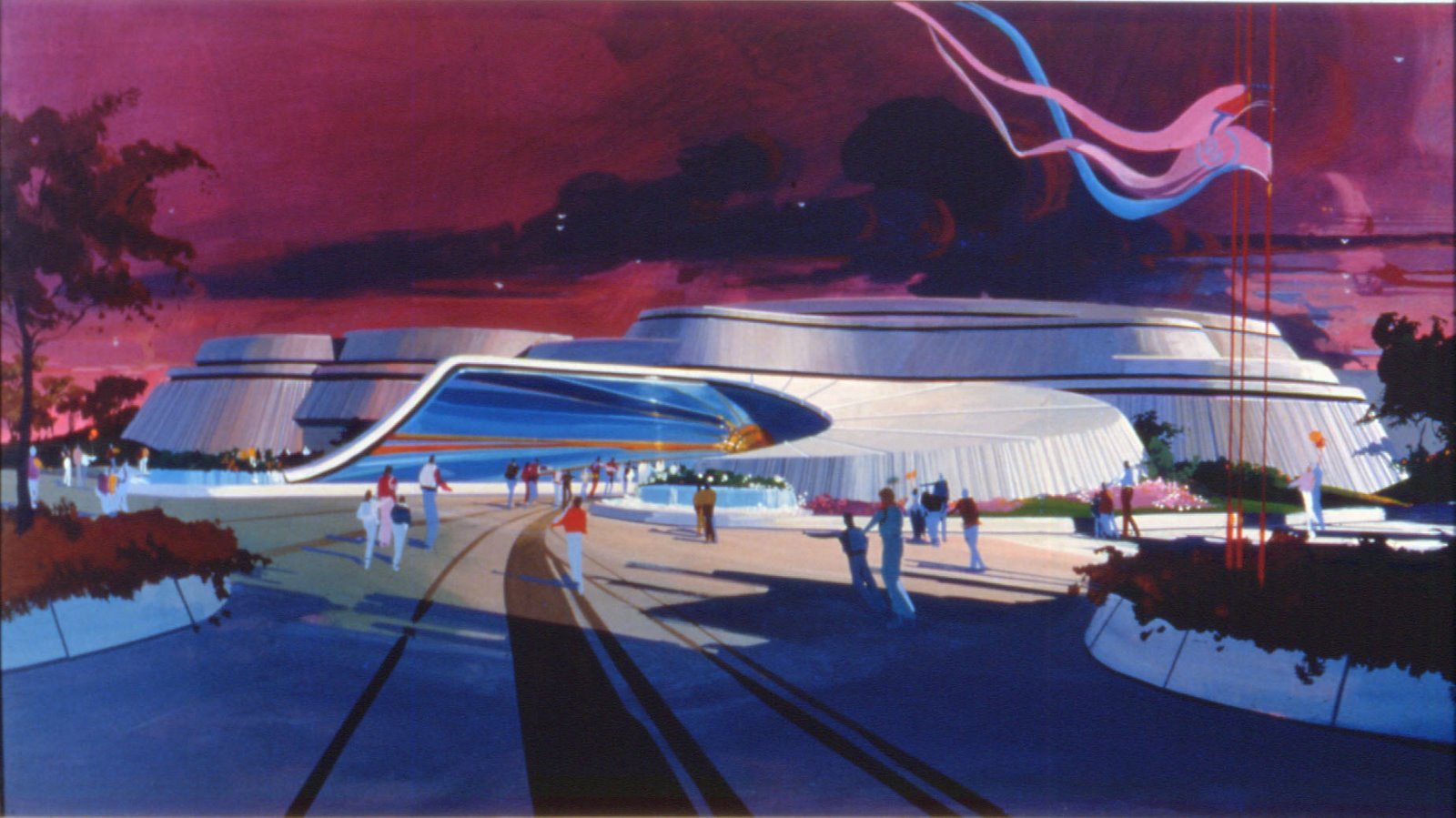
These "Main Street that never was" articles ends with this artwork from Eddie. Again, all my thanks to Eddie Sotto for his great comments on all these amazing concept-arts, it was fascinating!
Thanks to leave a comment or discuss this article on D&M english forum on Mice Chat
Artwork: copyright Disney enterprises Inc.













No comments:
Post a Comment