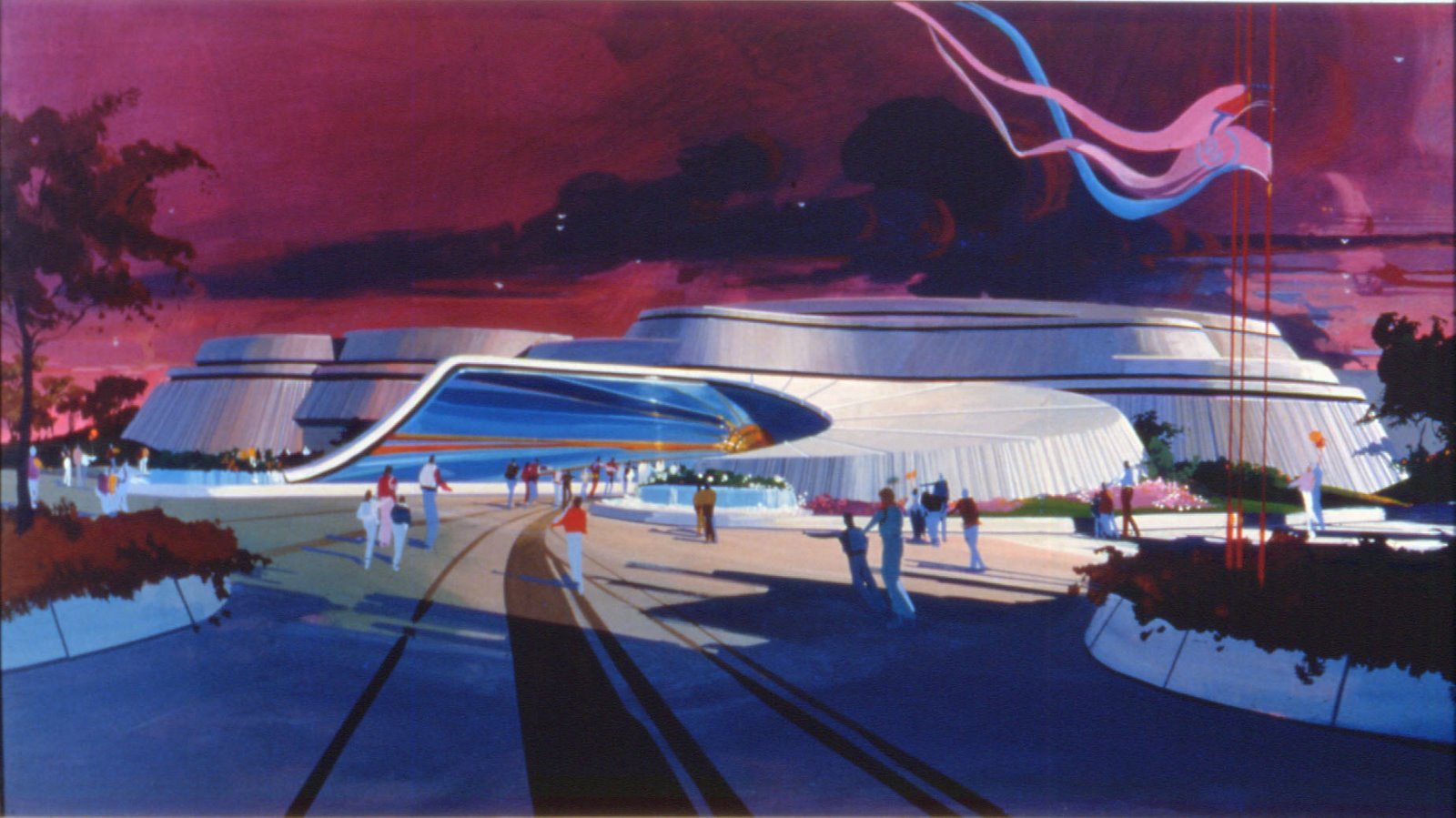
Remember one month ago when i did my second tribute to Eric Heschong artwork? In the article there was two paintings he realised for Disneyland's 1998 "New Tomorrowland". Eric Heschong artwork looked great but after seeing my scans, Eric notified me that one of his original Tomorrowland overview artwork - the one you can see below - has been extensively reworked by an unkown artist.
Eric's original artwork - without these additions - was printed up as a fine art print some years ago and is of course impossible to find now but Eric, extremely kindly, sent to me a copy of this signed print. The first thing i did - right after being amazed by the beauty of Eric's original artwork - was of course to see if, as Eric said, there was a lot of differences between Eric's "true original" painting and the picture released by DL marketing ten years ago.
And Eric is of course right, it's not the same images!!! Somebody definitely reworked Eric's original artwork and there is many changes between the two pictures as you'll be able to see by yourself. Above is Eric's original painting and below is the picture released by DL marketing. To check the differences between them open another window of your browser, click on each image to have them in big size and try to put them side by side.
Personally i think that Eric's original artwork is the best one, much more "fine", beautiful. I suppose that WDI asked for these changes in the artwork because they did changes on the final project after Eric did his painting, and Disney probably wanted to release an "official" image which reflected the final reality of the new land... Still, they should have follow Eric's original painting for the land design as the land looks so much better on it!
And for those of you who don't own Eric's Tomorrowland original artwork print the picture of it above is in mega high-res!
Pictures: copyright Disney














2 comments:
What I find most interesting about the work Eric did for Tomorrowland '98 is that it shows a new monorail design based on the older designs. It means the idea of the Mark VII having a retro style dates back to the 1990s and was to be a part of this project. Two years later when the Autopias were combined and redone, the monorail in that artwork is a Mark V, as the project was no longer at the front.
I lived next to Eric growing up and this is the only artwork of his that I remember. I feel honored to have been present from the beginning sketch phases to the final presentation. Thanks for this post. I remembered the fountains, specifically, and wondered where they were when I saw the revamped version. It all makes sense now!
Post a Comment