
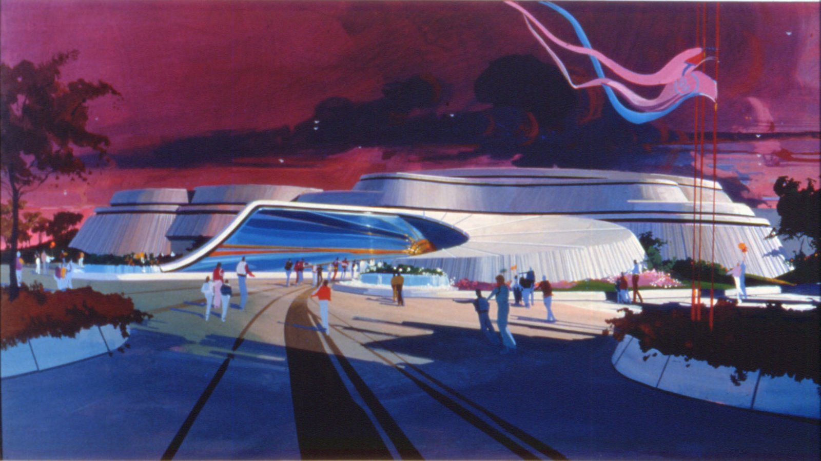
After the "Discovery Mountain " article of last week, here is the second part of this article, this time about the "final" version of DLP Space Mountain "from the earth to the moon" , with the original renderings and pictures of Imagineers at work.
As you've probably understood when you saw the renderings in the previous article, due to the financial situation of the park back in 1993, the Discovery Mountain project became suddenly too expensive, and the imagineers had to revise their blueprints!
It was decided to keep the “from the earth to the moon” roller coaster concept, and the Nautilus too, now located outside the building.The beautiful Columbiad cannon was always there, and even some reminiscence of the “volcano” first concept with these rocks emerging from the Discoveryland lagoon that you still can see today.
The “Columbiad “ canon is not only perfectly themed in a victorian way, but it's doing too a lot of things. The Imagineers could have design this 22 meters long canon only as an element of the decor , they did better than that. In fact, when the train is “catapulted” out of it, steam is projected in the front, and, too, in the back, like in a real one.
The upper part of the canon do have a “backing up” movement, and when the train enter it, before the launch , a door open , allowing the outside guests to see the arrival of the train inside the Columbiad. At the same time, a stylized sun on the side of the cannon turn right and left, and when all these elements work together, it makes the whole show “richer”.
Mind you, the title “Discovery mountain” remained in use until two months before the opening in 1995! Basically the change was for marketing reason: the executives thought that the word “Space “ would have been better understood as a clearer term for a “space roller coaster” by the visitors than “Discovery”... This is also why the initials “D.M” were still visible on the side of the trains as it was too late to change them, and the imagineers as well also like to keep a little bit of of the history of the ride in place.
Space Mountain first adventure “from the earth to the moon” from the opening day was a big hit . Great story line and solid theming by Tim Delaney, show producer, and his imagineers. For the first time inside a Space Mountain riders could directly walk in through the middle of the attraction, and watch the trains going by at high speeds between the meteorites.
The boarding room was designed as a victorian station which celebrates the “Gun club” first flight to the moon ( the name came from the Jules Verne novel ) and the “bronze” colour of the trains was perfectly chosen. For almost the first time ever, (in '95), the trains had on-board audio. (I have to say "almost" because the first time WDI utilized this unique system was the year before on the DLP Fantasyland "Casey Jr. Train.")
The launching with the cannon worked perfectly, and the ride was, in 1995, the fastest ride in a Disney theme park, with loops, etc, all that at 70 km per hour...
The theming in the ride was totally inspired by Verne’s novel: the train entered at high speed the “Lunar mining co” , then enter a huge meteorite, before he approach the moon , which was designed as a tribute to Georges Melies famous silent movie.
After a race through meteorites, the train came back to the station , passing through the “electro-de-velocitor” , another item inspired by the novel.
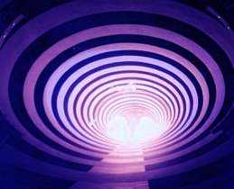
And there is the gorgeous night lighting. Designed by Michael Valentino, one of the best lighting expert of WDI, his work is stunning. It is so beautiful that it becomes “hypnotic” , you can’t take your eyes out of it. The mix of theatrical lighting and neon transforms Space Mountain at night in a kind of huge “space ship” and it's a wonder, really!
Two years ago, the Space Mountain "Mission two" was launched, with a totally new theming, this time with no relation to the Verne's novel. Among the new show additions: the encounter with a huge “Comet”. This is a big projection effect, extremely well done, but the genius idea is that , when you first see the comet from the train, you see it from a distance - when the train is still on the other side - and as the train goes on, he approach in the direction of the comet. In the same time, the comet seems to move on the opposite direction, which means coming in the direction of your train, giving you the feeling for a few seconds that you’re going to collide. Of course, the train goes over the comet, but the whole effect is perfectly done, specially with the new addition of the “star field” - similar to the US versions - projected on the dome of the building.
Right after the first loop, now is “galaxy” effect, before the train enter the giant asteroid - that was in the first version, but now with a mix of fog and light projection effect . The train goes down again, passing through a “cork screw” with meteorits thatlooks “in fire” - another projection effect . It’s also very well done , and it looks like if you were going to hit them...
At the top of the next “lift” awaits the “explosion” of a “super-nova”. There is another great idea before the arrival: a long red-neon “vortex” followed with blue-”flash” effect, which is supposed to bring back the train through “hyper space” at light speed to earth......before entering the “electro de velocitor”, one of the only decor element which remains from the first version .
It’s of course always difficult to describe with words the whole show - because it's a physical experience - but it’s real fun, always a speed roller coaster with a new musical score written by Michael Giacchino, who wrote the music for “the incredibles”. His score is good, goes very well with the new show, although i think the previous one by Steve Bramson was probably more “emotional”.
Below are two youtube videos, the first one , from johan30061967 shows the first version " from the earth to the moon " with a clever mix of on ride images and CGI video, and the second one is a brilliant 3D recreation of the "Mission two" ride by didyz.
Photos and Artwork: copyright Disney
Please note that photos 4, 5, 6 and 7 from the top show the model of Discovery Mountain, not the actual Space Mountain.













3 comments:
Tous ces concepts arts et photos sont vraiments grandioses. Merci Mr Littaye, de nous rappeller cette grande attraction qu'était Space Mountain : De la terre à la Lune.
Much appreciated ^^
I'm currently doing a graphic design project on the victorian/Jules Verne styling used on the original Space Mountain and this article has been a wonderful help ^^
Thankyou for putting this together. It must have taken alot of time and effort.
Matthew Thomas
Tout d'abord, félicitations pour votre blog ! J'ai une question particulière sur Space Mountain... ou plus particulièrement l'avant Space Mountain à Disneyland Paris ! A quoi ressemblait Discoveryland à l'ouverture du parc ? La zone "Space Mountain - Nautilus" était-elle couverte de végétations ? Bloquée par des palissades ? Star Tours et feu Captain Eo étaient-ils visibles depuis l'entrée du land ? Je n'arrive pas à trouver de photos d'époque (en gros, entre 92 et 93, le temps que les travaix débutent...).
Post a Comment