
Hello everyone, Here is the part two article about the new “land” at the Walt Disney Studios, and this time, more specifically about the new Hollywood Boulevard. The photos are in high-resolution, so double-click on each to see them in big size and explore the details of this beautiful theming.
It is undoubtedly a strong visal improvement for the WDS , or to say it shortly : “at last, some theming! “. The imagineers did a great job with these new decors and there is no doubt that it will help the park to be more successful, which mean more visitors, and so, more money to built future new attractions.
Everything is not perfect, though, as we wii see. But let’s begin by the good part: when the visitors exit the Studio 1 they now have in front of them all the new decors you can see below, including fake coconut trees, and real palm trees.


And now that it is finally open, i can show you this Hollywood Boulevard on the other angle, facing the Studio 1


The windows on each building have been wonderfully themed, like the one of the “Franklin departement store”....


The last one on the left , under the “Fashion” sign is in fact a small Pin shop, still closed last sunday


This article was also published on the miceage website today, and Al Lutz , the webmaster, very intelligently noticed that one of the mannequin in the windows could be a tribute to one of the Twilight Zone episode , the 1960 season one. To know more about it, here is the link
UPDATE 19/12 : After checking with DLP Imagineering, it seems that "Any resemblance to anyone living or dead is coincidental. The mannequins were purchased solely on their coherence to the style of the 1950's; no other criteria were used in their selection."
So, we will say that it is happy coincidental and a non-voluntary tribute!
Other building in the front, like the “Travel agency” or “Gower books and music” also have themed windows - sorry for the reflections in the windows...


Also , another themed window outside the Tower of terror gifts shop.

The imagineers put quite a lot of different props in the street, like an old phone booth, a parking meter, etc...


At the end of the boulevard, the entrance for the Tram tour and the “Cruella” car is display again.

Visitors are supposed to access it through the hole under the Hollywood hill, but in fact you can reach the Tram tour station through the left ot the right of the backdrop.

Now, all this gives really a different look to the park, and is visually impressive


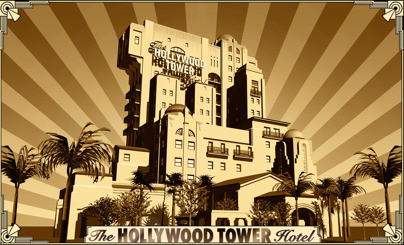
Here is a photo of the TOT at sunset

However there is two things that i really don’t like - i even consider it like an incredible esthetic mistake - it is, first , the back of the “La Terasse” building, I still don’t understand why they didn’t “open” the arcades instead to leave a flat and unthemed wall like it is...i understood that it is supposed to be there where people can leave their trolleys, but when you think that it is right in front of the TOT main entrance , at ten meters from the beautiful TOT lobby.....( the picture below is shoot from the TOT entrance, with the hotel lobby in the back )

And the second one is that small building you can see on the left of the photo below.
What the hell is THAT?!? It’s ugly, and i doubt that these wooden doors will ever open one day for anything good . These 10 meters long buildins are probably the worst themed element in both parks! And it’s also right in front of the entrance “side” of the TOT! Very very bad, really. Visually speaking, it is litterally spoiling that zone....
UPDATE 19/12 : Somebody gave me the info that this building will in fact hiding electric equipment. If it's true , then it's better than nothing...

But how is this Hollywood Boulevard looking at night, what kind of lighting did the imagineers? On the photos below shoot by Alexandre Rosa - among some others above - , the previous - and very rainy - week-end, you can have a better idea of the great lighting.


The soft opening of the Tower of terror for the annual passholders is still going on, and until now, everybody seems very happy with the ride, always too short, but those who did it at DCA know what i am talking about.
Although the TOT was a half-success at DCA, i am absolutely sure that it will be a tremendous one here, no doubt about that.
So, what’s next , now for the WDS? Well, first the “Stitch encounter” will open in march, a bit before the grand opening - press event of the TOT, scheduled for April 5-6 2008 - note that the TOT will be open to everybody from december 22.
It may seem surprising to wait 4 months to do the grand opening, but it’s all about marketing and the fact that april is the beginning of the high season for theme parks. And also that the park decided that the 200715th anniversary event will last until march....2009! In fact, this anniversary year have been incredibly popular with 2 millions more visitors than 2006 season, and so they’ve decided that the 15th anniversary event will last until the 17th anniversary! It may looks a bit exagerated, but as long as it brings more visitors in the park, it’s good for everybody, as, as i have said before, it will give them the money to build new rides. Which one? This, we will talk in a future article....
In the meantime, if you want to see more photos and details about the new placemaking, you will find more on Alexandre Rosa web site.
Photos: copyright Alain Littaye and Alexandre Rosa













1 comment:
I think those "ugly wooden doors" are supposed to be a car garage from the 20s/30s when you had to manually open them from side to side (they didn't pull up like modern ones). Either for the HTH employees or the guests that didn't come by limo/taxi.
IMO, just extra theming for ToT, not something that will benefit guests, just details for enthusiasts.
Just a guess.
Post a Comment