
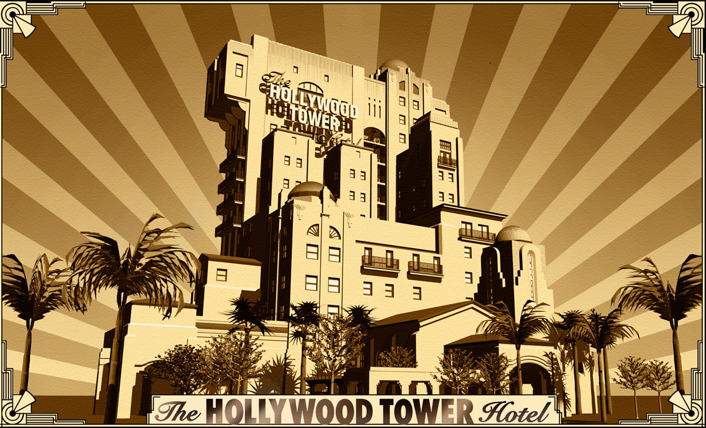
I'm not a big fan of the new Disney's Hollywood Studios 30th Ann logo - may be because i dislike so much these new style of Mickey and Minnie, like many of you - one of my reader even left a comment on the D&M Facebook page saying "they look drunk, high or homeless"! The reason why Disney put them in this new logo is of course to promote the new "Mickey's Runaway Train" ride inside DHS Chinese Theatre opening later this year, in which Mickey, Minnie and Goofy will have unfortunately their latest look.
Anyway, so i had fun to create variations of the logo and did different try. And because it's supposed to be DISNEY's Hollywood Studios i thought that a tribute to Walt would be welcome. I also did a new version with Mickey and Minnie as we love them and introduced for some versions some gold color which always fit well with an art-deco font, though you also have a B&W version for each.
Let us know which one you prefer!


Pictures: copyright Disney


3 comments:
All look better than the actual logo, but I particularly love the very first one with gold lettering and with Walt.
WOW ! Thanks for sharing
The best fantasy book
Shame on you for bashing the current designs of Mickey and Friends! All the bad things people like you say about them are false! 😡
Post a Comment