
Disneyland released today a new picture providing a full look to Sleeping Beauty Castle with its new colors ( picture above ). It's of course a big change with the preious castle colors ( picture below ).

Mmmmh, may be a little bit too much gold, specially on the arch entrance? I don't have anything against the gold color but there is a big rule saying that "If everything is special.....nothing is special”.
If you want to see how it will look without the gold on the arch entrance, this picture from Blog Mickey shot just a few days ago provides a good example as the gold entrance arch is hidden by the fences. Without it, it work not too bad, though i still think that the turrets top blue color is a bit too “electric blue".

In a O.C Register article WDI Kim Irvine who was the lead Imagineer on this renovation tells us more: "“People when they come to Disneyland they expect something that’s different than what they would see on their city streets or in their downtowns, We have to push the color, we have to push the fantasy. People get used to seeing it faded. Even if we painted it the original colors, it would look strikingly different. These are not far off of the original colors at all. The only thing that’s quite a bit different is the roof. The pinks are all very much the same and the trim colors are exactly the same."

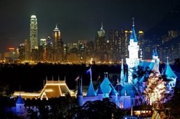
"All our other castles keep getting bigger with more towers, even our sister castle in Hong Kong, they’re adding onto it and making it gigantic. We’re never going to do that to our castle. It’s always going to be this little castle. It’s the charm and the centerpiece of Disneyland. But what we can do is push the colors a little bit more and add a little pixie dust.”

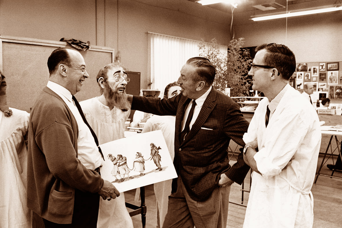
In a January video below Kim Irvine was also paying tribute to Herb Ryman original rendering for the castle ( picture above ). Watch Kim telling us more about the new colors. The castle reopen May 24, just in time for Star Wars Galaxy's Edge opening on May 31.
Pictures and video: copyright Disney, Blog Mickey
















2 comments:
Hi,
I quite like the new version. The colors are more 'realistic' than the previous version. The castle wall is grey again and not blue and pink, this is a far better choice (even for a made-up Disney castle). The shades of the castle itself are less baby colored, and that's a good thing too. Personally I'm just not a big fan of the pixie dust on the rooftops, but it's quite delicate. Overall, it's a big improvement.
I just came back and saw the top half of the castle. The scheme was questionable and the "pixie dust" tacky. The castle was never glowy to begin with. I ran into a 50+ year cast member who knew Walt Disney and had many interactions with him. He said Walt commented to him that he did not want the castle to "stand out" but rather draw people down and blend in.
Perhaps Disney imagineers need to have along chat with past cast members and seek out Walt's visions a little more.
Thanks
RWR
Post a Comment