Dear Disney and more readers, this is it. As promised some weeks ago Disney and more has a brand new design! A much larger column which will allow to post in future articles pictures in bigger size - although previously posted pictures will stay at the same size - as well as larger videos, more "space" which makes the reading more pleasant, a new typo, and above all a design more pure which is exactly what i was looking for since i began the site two years ago.
But this is only the beginning of many other changes. As you can see the side bar on the right always have many links to the previous articles. This will change too, little by little. Although Disney and more looks now more like a site than a blog, the Blogger structure is still there and some things are impossible to do. For instance, on a real web site, if you click on a button to go to another section - let's say for instance the "pictures" section - you can have a different design on that page or a different header, colours, etc... With a blog structure it's not possible. If you click on any link on the side bar, you'll arrive on the page of the article, but with the same header image, etc...
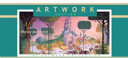
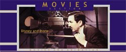
And, as i would like precisely to change the design, header, colours, for each section, the question was: how to resolve this problem. I found the solution - thanks to a little cheating - and this will allow me to begin the "phase two" of the D&M new design. In fact, the trick is to create new blogs for each section (artwork, pictures, Disneyland Paris, etc...) and that's what i did. Little by little i will transfert each article of each section to its new blog - the "artwork" articles in the "Disney and more artwork" blog, for instance - and once it'll be done, all the "artwork" articles links you have on the side bar will disappear except one link to the "Disney and more artwork" blog. A normal reader won't even notice that he's sent from a blog to another one, but most of all it will allow to have different colours, a different header, etc... in all, there should be more or less ten different "Disney and more" blogs, just as many sections you'll have now on the side bar.
The goal, finally, is to give you an even more pleasant web site, but also more beauty as you will see when everything will be finished. All my thanks goes too to the young Maureen for her precious help in this new design. Hope you will enjoy the new Disney and more - thanks to let me know in your comments!
Edited June 29: Thanks to your comments, i've noticed that some little things must be fix, beginning by the links which disappear when you put your mouse on them. I have fixed this problem now. As for the too long side bar, as i explain above this is DEFINITELY going to change soon. Thanks for your patience, it will be even better in a near future!
Sunday, June 28, 2009
Subscribe to:
Post Comments (Atom)


10 comments:
LOVE the new layout. Very clean, bright, open, and most of all Disney.
There is however one single flaw in the color palette. When you scroll over a link it turns white, making it seem to disappear against the white background colors. Perhaps you could change the scrolling color.
Other than that it's a very welcome and well thought out redesign!
Looks good to me, although I had no problem with the old theme either. You've got amazing content either way!
just a smidge too wide on my monitor, losing about 1/4 of the far right part of the sidebar (perhaps you should make a fluid center instead of fixed). Also, the page length on the sidebar is way too long for the single post pages. Other than that, keep up the good work.
i love this new layout :)
it's clearer than before !
i'm hurry to discover new larger pictures and vids :)
MERCI :)
The new design looks great, simple and clean. I do have one suggestion though. If you could somehow get collapsable sections for your past articles it would take up less space on the blog and it would be easier for site visitors to look them up. The site would also be a lot shorter instead of having a long list that lasts longer than the articles section.
Either way, your articles are amazing and I look forward to more.
looks great!
Thanks to your comments, i've noticed that some little things must be fix, beginning by the links which disappear when you put your mouse on them. I have to find in the HTML source code where it is programmed, but hopefully it will be done soon. As for the too long side bar, as i explain above this is DEFINITELY going to change soon. Thanks for your patience, it will be even better in a near future!
Hi Alain,
I just had a look at your css. You need to find
a:hover {
color:#ffffff;
text-decoration:underline;
}
and remove the "color:#ffffff; " part. That way it will remain the same color and only get underlined on hover.
Hope this helps.
Regards,
Nicolai
Thanks, Nicolai! That's it, the "link" problem is resolved!
Yep, It's all better. Thanks for taking care of it. I love the layout and only expect that it will get better! I love how open it is!
Post a Comment