
Hello everyone. I was at DLP this week-end, especially at the Walt Disney Studios and i'm sorry to say that i don't have good news. In fact, i came back home in pretty bad mood, and i'm going to explain you why.
When the WDS opened seven years ago, guests had the choice between three restaurants. The first one is located in the Studio 1 and basically is a fast-food, the second one is "Au Rendez-vous des Stars" with an art-deco style and is a self-service. And the third one was the Backlot Express Restaurant, also a self-service but the best themed of all three.
In fact as you will see below the Backlot Express theme was a "movie props warehouse" and imagineers found hundreds of props - small or large - and spent obviously a lot of time to put them all over the restaurant, and everything was done very intelligently. In two words, the theming was great and it works perfectly with the park's theme, which is supposed to be, let's not forget it, movie studios. It was by far the best themed restaurant at the WDS.
Recently for unknown reasons DLP's management decided to change not only the decor or the theme of the Backlot Express but also its name. Gone is the Backlot Express, the new name is the "Blockbuster Cafe". The entrance is themed on High School Musical - what a blockbuster! - and the room on the left is themed on Pirates of Caribbean movies.
And it's a disaster. Really. I don't like to be harsh and i'm sure they spent some time doing this new deco, but honestly, frankly, they've screwed everything. It was better before and it's very bad now, there is no soul, no genius, nothing.
Let me show you first how it looked before. On the top, a picture of the old facade.
And below some shots of the previous decor with hundreds of props everywhere.


You really had the feeling to be in a movie studios props warehouse and that was great.
And now here is the new decor of the Blockbuster Cafe. First, the exterior. They've simply changed the name on the front and put Pirates of Caribbean posters on the left of the entrance.


Pictures of the main room where all props have disappeared. Instead, plenty of HSM banners all around.


The room on the left have a Pirates of Caribbean theme. Pictures on the wall are huge - and flat - pictures of pirates ship (from the movies). The light is voluntarily darker even a bit "blue" thanks to blue film they put on the windows, and chandeliers hang from the ceiling all around.


In a corner, some POTC props - supposedly coming from the movies, but i wouldn't bet on that.


Because i tried to shoot the pictures on the best angles, perhaps you'll think that this POTC room don't look that bad, but frankly when you're inside it, it's cheap. It's not the worst, but it could have been so much better. You can feel that no big budget was available for all these new decors. And it's a pity because the previous Backlot Express decor had inspiration. The worst is that this new Blockbuster Cafe may be successful! Regular guests are less difficult than we can be and considering that HSM and POTC are very popular, the Blockbuster Cafe may become popular too! Let's hope i will have better news from the WDS next time!
Thanks to leave a comment or discuss this article on D&M english forum on Mice Chat
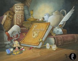
Pictures: copyright Alain Littaye or copyright Disney


20 comments:
Alain, I agree with you whole heartedly. I'd rather eat in a prop storage facility than eat in a locker room. I would go back to the prop theme and do it even better which some larger items like air planes hanging from the rafters as well as Western wagons or ship parts etc. that could be lowered from rafters when needed.
That's unfortunate when something changes that you've been accustomed to - and enjoy - but you're right, from your pictures, to an outsider like myself, things don't look all that bad (especially considering it's a "fast food" restaurant). In fact, at a time when the company is tightening their belt, I'm surprised they would spend money to do this... other than the obvious - to push more product.
Aside from what your pictures show - which objectively, to me, say "goodbye Home Depot, hello strange bunkbed of themes", I think we can all agree that less branding is better - and the Backlot Express definitely looked like it was a more neutral atmosphere.
Yes this is not theming but blatent advertising.I also think its a move backwards but then again the service in there was always bad and usually your meal was cold once you had managed to pay.
I never liked the Backlot Restaurant, wich I always found cheaply executed and simply screaming the low budget behind it. But this horrid creation make past theming seems oh-so-great... The curse of WDS strikes again.
I think it actually looks much better now
what a nightmare!!
Glad I'm not the only one who thinks this looks actualy good. This is very good marketing. HSM is hugely popular and families who are eating there will probably have there kids screaming for HSM merchandise when they are done eating. Same goes for Pirates. The orriginal theming was a mess. No one could relate to it. Now we have props (real or not) from popular movies. People forget we're still in crisis and Disney needs to generate money. They do that with this new theming. I was there last week and I liked it. The place was packed!
In terms of marketing it can be a good idea, but it terms of theming, i'm sorry but the previous one was better.....although i can admit that some of the guests could have difficulties to understand the "props warehouse" idea.
I find it intersting that just last week you wrote a column about the lack of changes coming to all the Disney Parks in the coming years and how disappointing that news was. Then this week you write about something they did change, and you are equally disappointed. I'm not saying I like the changes having never been there, but changes are going to happen over time, some we like, some we don't. Maybe the next change Disney makes in the parks will be something you like. Keep up the good work, always love reading your columns.
I'd say your pix justify your anger. the HSM crap looks really generic and half-hearted. the POTC doesn't look too bad, still... not very original. looks like a slightly darker version of Long John Silvers or something similar. it is somewhat disheartening that all opportunities to synergize or cross-platform market these properties trumps originality... worse, it replaces things that are actually higher quality!
It's a disaster !
I don't like the new theme. HSM is really not a good theme for a restaurant ! And POTC props... let me kidding ! they takes this from the POTC attraction no ?
I never like this restaurant but the props was fun. Now it's worth !
i will continue to go to Le Café des Cascadeurs :)
I actually find the changes pretty harmless, as I was underwhelmed by the original design. Being from America, though, I can say that the HSM design really does look like an authentic gym/locker room...for whatever that's worth. I guess I'm surprised that HSM is as big of a property in Europe as it is here.
I like it better now. The two movies are familiar with guests, unlike a wreck of movie props just scattered around a restaurant. I think you're just suffering from the Disney fanboy syndrome where you don't ever want anything to change.
As some kind of "Disney Fanboy" I actually want things to change, but in a right way.
The original idea probably was great, but it wasn't executed to Disney standards. If it was done on proper budget, it would really look like an old warehouse, there would be nifty details everywhere, everything would probably look old and there would obviously be some kind of hidden story behind most of it.
The "revisited version" still looks bland and ugly on the outside (since nothing really changed) and the whole idea on the inside also sucks. It looks cheap on the pictures and the whole idea of it... don't get me started...
If you ask me, Disney should stop with this marketing drivel inside their parks. Why does every movie need an attraction or a restaurant?
Most popular Disney attractions could stand on their own for decades. Actually, I think you can be much more creative if you don't have to adhere to some kind of franchise-box of what is possible and what's not.
I'm paying good money to be in that theme park, so your marketing already worked. If you want me to spend more on your franchise, make it work, so I actually like what you're offering to me.
I usually don't eat at the WDS, I've been to Backlot Express once and it was OK, but only because it wasn't busy. The food is nothing special and the theming was "OK", it was obvious that there was no budget to make it look real.
Maybe they could have used this budget on making it more real, but they spent it on "improving" marketing.
What strikes me about the original design is that it seems to have a lot of the qualities of a traditional café, and judging from the photos, it may have been a relatively relaxing place to stop and eat. Having been to an actual prop warehouse, I can also say that it's very easy to get absorbed into looking at all the jarringly unrelated items.
The furnishings and style used with the new themes look like they have more in common with fast-food restaurant design, which is intentionally made uncomfortable, so that there is a higher turnover of patrons.
"The Horror, the Horror..." (to quote Joseph Conrad, or, if you will, Marlon Brando (no, he was not in HSM...)
Another Disney (EPCOT) fanboy here - and I'd have to say this may be an improvement over the crap they had hanging on the walls previously. I didn't care for the random clutter everywhere--it felt clausterphobic.
The new spaces look more open and airy.
The huge cut out graphic of the High School Musical characters on the wall is tacky. It isn't theming, it's lazy pseudo-theming. They could have used something that would actually be seen in a high school, like a wall of trophies with the character's pictures in frames, or posters for class president, etc.
I loved the Backlot! *sniff*
And I could relate to the stuff too (always wanted to take that Speederbike with me ;P)
It was a pretty big .. I don't want to be as dramatic as to say "shock", but at least a huge "wtf?! Oo"-moment at the last visit to see all the lovely props gone, just to be replaced with some cheap HSM stuff >> (And we're eating in the locker room why? Oo The cafeteria would have made more sense .. or at least it would have been less eww >w<)
And even though I love Pirates, I'm not too impressed with that part either (have to wait to see that in person though).
But I'm happy that what I saw wasn't the final thing and maybe it'll turn out okay in the end ^^
I like the pirate area but not so sure about the HSM.
Post a Comment